Thursday, August 30, 2007

Stick Figure Fundamentals

“Do you need to know how to draw to be a CG animator?”

This question has been asked for years. The politically correct answer has been “No, you don’t need to know how to draw to be a CG animator, but it can’t hurt.” This answer developed because there are lots of working CG animators in film studios who either don’t draw much, or worse, who steadfastly refuse to draw and nobody wanted to offend them.

I used to agree with this answer, but a number of years ago I learned some things that changed my thinking. So I’m going to step out from under the politically correct umbrella for a moment and say that I do believe that to be a good CG animator it is absolutely vital to have a fundamental understanding of what makes a good drawing. After teaching, training and supervising animators (both students and working pros) for a number of years I’ve come to believe that the politically correct answer is robbing many CG animators of their chance at achieving greater success in their work. A large portion of my notes to my students and those I have supervised were related to the quality of the poses or breakdowns they were making. What has become manifestly evident to me is that to fix these problems demands an understanding of what makes a good drawing. What is needed is a solid grasp of what I call the Stick Figure Fundamentals of a good character drawing.

Whether we use Maya or a pencil when we animate, the one constant is that we are creating images- drawings if you will. You may not be using a pencil line made by your hand on paper, but you’re still making a drawing by manipulating a rigged puppet into shape. It’s only reasonable to think that if you’re going to be in the business of making drawings then you should want to make good ones. A good drawing has a sense of solidity, weight, internal tension, balance, force, line, silhouette, flow (leading the eye) and expression. These fundamental values of good drawing can be seen on something as simple as a stick figure. They are not exclusive to the domain of pencil and paper. They can and should be expressed in CG animation as well. This isn’t about doodling a few scratchy thumbnails on a sheet of paper for your scene planning. This about looking at your CG puppet’s poses right in the camera view and thinking about them as drawings!

Here’s an example. First, a relatively normal CG pose…. (click to see bigger if you like)


The draw over shows what I mean by “stick figure fundamentals”. This pose is OK-ish, I guess. But it just feels kinda awkward and stiff. There is some flow (line of action) in the torso, but not enough to overcome the sense of incongruity that nags at the mind of the viewer. The torso feels stiff and there’s not a sense of internal weight in the body. The sternum is pointing the same direction as the abdomen and the pelvis, thus there isn’t any torque or tension in the body. The angle of the right shoulder doesn’t add a lot of weight to the pose. The head is pretty much vertical, as is the neck. The neck doesn’t feel like it’s flowing out of the shoulders. The limbs aren’t guiding the viewer’s eye. The legs kinda just stop because they’re tucked back. The left arm is competing with the face for attention being up so high and strongly silhouetted. This wouldn’t be a problem if he were waving to someone, except that this character isn’t supposed to be waving. They’re just excited about the ball on the pedestal. Now you may be thinking “Well, you made it look like that on purpose!”. True. What I did was pretty much copied a pose I recently saw in a big budget CG feature film trailer that I downloaded. I was careful to mark out the angles and faithfully recreate them. No, I won’t show you the original pose from the trailer. I’m not out to make anyone look bad, I’m just trying to illustrate a point.

But maybe you’re not seeing the problem. Maybe you look at this and think “What’s he going on about? It looks perfectly fine to me.” So let’s see what this looks like when we apply some basic Stick Figure Fundamentals of good drawing to this pose… (again, click for bigger-ish)

See how much better that is? It has a sense of internal weight. The body feels organic, alive. You can sense the right arm and shoulder holding up the body weight. The chest is rotated a bit on its Y (up) axis to build some inner tension in the body. The character is using the available depth in the scene leaning forward, adding energy to the expression. The shoulders, ribs and hips are all showing the effect of gravity. The pose has better flow than before, leading the viewer’s eye from the limbs through to the face. The head and neck angles accentuate that flow. In general it feels more comfortable to look at while having a bit more energy. It really takes no more time to make this pose than the previous one. There are no special rig tricks here. The only difference is that we’re applying some basic Stick Figure Fundamentals. And I make no claims to being a good draughtsman by any means. Anybody who’s seen me draw knows full well that I’m no Marc Davis with a pencil, but I know enough to make these improvements. Here are the poses side by side in case you still can’t discern that much of a difference…

Many CG animators are so intimidated by the thought of drawing that they don’t bother to develop their ability on even a rudimentary level. But if you just get good enough to grasp the stick figure fundamentals it can’t help but improve your work. Focus on learning what makes a drawing have solidity, weight, tension, balance, force, silhouette, flow, etc. Don’t get caught up in details like curves vs. straights or cloth or shading or any of that stuff. We’re not trying to get jobs as character designers here- we’re just trying to express good poses and a sense of internal force in our characters.

My first exposure to the idea that CG images are just drawings was when I first had a 2d animation supervisor draw on top of print outs of my CG work. That was a real eye opener. So I got the idea to draw stick figures right on top of screen grabs of good poses from animated films. I did this quite a bit- I still do. I gain so much by literally drawing over the work of those who are much better than me and learning from their hands what they were thinking. (not coincidentally this is how assistant animators learned the craft back before computers- redrawing their lead animator’s work day after day, making inbetweens, etc.). Then I started taking screen grabs of my own CG poses and then drawing over them in Photoshop. The differences between the good stuff and my weak puppet poses were plain as day. So I worked to make the puppet look like a good drawing. I kept at it til I was satisfied. Just a few months of doing this and the quality of my animation improved so dramatically that I surprised myself. I also started seeing things in animation that I never saw before. It’s like I had gained access to a treasure chest of new animation understanding. All because I stopped thinking that CG animation was totally different than other forms of animation just because it was done with computers.

CG animators should never stop thinking that they are making drawings- ever. The drawing mindset should not stop after the thumbnail planning stage. It absolutely must be present in every stage of your work. There is no technical excuse for making weak, lifeless, weightless, stiff, off-balance, uninteresting and discombobulated poses for our characters. An understanding of the stick figure fundamentals of good drawing can be had in rather short order. There is no shortage of information to help us- there are all kinds of good books, courses, forums and blogs available that can help develop an understanding of the basic fundamentals of good drawing. By far the simplest and best way to learn is to get over your fear of the pencil and just start drawing. Don’t choose to live in self inflicted ignorance just because you use a computer to make your animation.

I wish I had someone like me writing this stuff 14 years ago when I was starting in CG animation. *sigh* I suppose I should get back under that umbrella now. I’m sure a storm’s a comin’.

Friday, August 24, 2007

Just “Animator”, thank you.

362527788_a603f4195b.jpg

As I’ve spent a good part of this week unable to do a lot of work (thanks to a recent bout of the flu) I’ve decided to put the time to good use in further developing my thoughts regarding the nature and exploration of my animation.
I’ve been reminded that the medium is not the technique. “Medium” is a pretty broadly defined word, but for me I needed to narrow it down or run the risk of getting mixed up. The medium of our expression as animators is not pencils, paper, puppets, or pixels. It’s animation. Whatever we say, however we say it and whatever it looks like visually we do so through the persistence of vision as sequential images and sound unfold. Animation is our medium.

All the different ways of making animation are techniques. Whether we draw it, paint it on glass, do cut out paper, use stop-motion puppets or use a computer- all are merely techniques, not the medium.

While most animation is made by sequentially filming the manipulation or display of physical elements (drawings, stop mo sets and puppets, cut paper, etc.) this does not equate these physical forms to animation as medium, at least not the way I’m narrowly defining it. A puppet of Wallace is not animation. A drawing of Bugs Bunny is not animation. An oil stained sheet of glass is not animation. These are just the physical artifacts of different techniques for making animation. Film is not the medium, no more than television or computer screens, paper flipbooks, zootropes or digital projection. These are merely storage and delivery mechanisms. The medium is animation itself.

Like music, animation cannot be stopped and still exist. Stop playing the instrument and you no longer have music. Stop running the projector you no longer have animation. If you record music that recording is merely a container. A CD is not music. Similarly the film reel (or hard drive) is not animation, it’s just a container. The data on the CD must be temporally projected aurally in order for music to exist. The film must be visually projected in sequence in order for the animation to exist. You cannot hold music. You cannot touch animation. You can manually grasp the instruments of creation, but not the creation itself. No wonder the earliest pioneers in animation combined their work so closely with music- the two share exact natures.

CG is different than most common methods of animation in that it is utterly lacking in innate physical form. CG has nothing material like a stack of drawings on paper. It has no innate physical expression to define its look. The end result is that as a technique CG is limited primarily to emulation. However in this area it excels. It can convincingly doppleganger aspects from a number of other techniques that are based in the physical realm with great facility. Thus inviting the next thought.

Previously I had started to develop the idea of CG animation as being akin to a temporal collage. Collage is not a medium- it is without innate material form. You cannot go to your local art store and buy a box of collage. Collage is a technique that takes all manner of objects and images (inputs) and arranges them visually to express an idea. Collage is materially agnostic. CG animation shares this nature. The key difference being that in CG animation one must digitally mimic, recreate or capture the inputs that collage can use immediately in the physical realm.

By reducing CG (and all other ‘kinds’ of animation) from medium to technique I find an interesting mental pattern emerges. I find my thinking liberated from being driven by any sense of medium-ism or a puritanical frame of mind. Since the medium is animation and all forms of it are merely technique then we are free to mix techniques to achieve the desired end result. If one wishes to master any one particular technique and exclude the use of any other in making animation that is a self directed imposition- not one inherent to the medium of animation. The ability to combine visual elements from different techniques- whether material or immaterial- opens doors for a myriad of end possibilities. We can make our animation out of any combination of techniques and visual signatures- so long as we artfully and skillfully use them. The need to be purely CG, purely hand drawn or purely anything is totally arbitrary.

Of course this isn’t ground breaking stuff. Examples of all of these conclusions abound. This is merely a travelers guide to my thought process as I seek a new mental framework from which to operate. As noted earlier I have realized that the problem of my literal mindedness in regard to CG animation hasn’t been a lack of technology or abilities in CG, but instead a lack of open minded thought on my own part. That is why such a pursuit of a new framework of thinking about how I make animation has been a vital personal exercise. I feel ready to move forward without concern over adhering to any pre-conceived notions about the proper use of a technique or “right way” to do anything. The first thing I need to do is shed the label of being a “CG Animator”. I don’t wish to be defined by a technique. Such a one is nothing more than a technician. Whether I use CG exclusively is irrelevant. Indeed it would run counter to most of my recent conclusions to do so. When the label goes, so do the walls. The locks are turning.
From now on I am just “Animator”.

Monday, August 20, 2007

Limitations

shackles.jpg

I’ve been sick as a dog the last few days (nasty flu) but I want to continue my previous discussion. See part 1 and part 2 in case you’re joining the conversation a little late. Take time to linger in the comments for each post- some really good stuff can be found there.

In the Abstracted Essentialism form of visual construction the editorial emphasis is reductionary. The artists are laboring to boil things down to their minimum elemental representation to express the essence of a thing. Anything that is not deemed essential to communcating the meaning - detail, accuracy, specificity- is edited out. Often the driving force behind what gets left in and what gets left out are the visual limitations inherent in the medium. By way of contrast for its first 20 years in practice CG, with its strength in representing realistic and literal forms of light, shade and shadow, the bulk of the effort in CG development has been to find new technology to show natural phenomena that couldn’t be shown before. If there exists a technological limitation for showing a natural phenomena- no matter how minor- it must be eradicated. Thus in general the CG editing process is mostly additive in nature. What more can we put in?

CG technological development focuses on shoring up current inabilities in representing natural phenomena - always with accuracy in reflecting reality as the benchmark for success. As limitations are removed there exists an implied imperative for all CG imagery to use these technologies with a high degree of expertise or risk being labeled as inferior (The Hoodwinked Syndrome). A kind of literalism arms race has developed amongst the technical elite in American animation studios. It doesn’t take a psychic or a prophet to discern where this is headed- the end game of this is a product that passes for live action film- a breed of heavily production designed, highly polished puppetry that primarily apes live action film conventions. We see this in effect now (read the SIGGRAPH course notes on Sony’s Surf’s Up if you’re looking for an in-depth example of this approach at work) and it will only become more evident with time. I’m not saying this is bad or portends the end of civilization. I’m no artistic pharisee- I’m just noting that it is what it is. This visual approach has validity in communicating ideas. My only contention is that it’s not the only valid approach for CG. (always with the caveats, sheesh)

Traditional media like paint, pencil, pastels, etc. have distinct and immutable limitations. There will never be a sub-surface scattering tube of oil paint or an ambient occlusion camel hair brush that you can buy at an art store. No image ambience based lighting canvas will ever be invented. If you wish to express these natural phenomena you must know how to do so only with the ingredients at hand- oil, brush, paper/canvas and pigment. It’s true that a person with enough time and skill can represent any of the natural phenomena that CG can in a manner that can be strikingly literal and specific. However this application represents a miniscule amount of analog artistic effort in traditional media. Instead what we see is an enormous range of abstracted expression with natural media employing all manner of visual languages. Anecdotally it seems reasonable to conclude that the technological limitations of analog media inspire greater expressive inventiveness. Always the matter comes down to how much do you accept those limitations as opposed to how much effort you expend in overcoming them. Within that answer lie the whole continuum of styles.

Two things emerge when I seek a practical application for going in a more essentialistic direction in my own work. First, to inspire greater imagination in essential expression I should limit my reliance on technological tools and solutions. However if I do allow myself to use a technological solution I ought to use it for something other than the literal expression of the natural phenomena for which it was designed. Secondly, I should strive to be less literal minded in how to express objects and elements- not an easy task for someone who started out in CG and has worked their entire career in that medium. To varying degrees the literalistic mindset has colored all of my previous choices, so it will be quite counter intuitive at first. I’m sure I’ll slip into that mindset and will need to backtrack in order to stay on course.
For as long as I can remember folks in the CG community have always looked for some kind of technological magic pill to solve their visual challenges. Since most of the visual challenges have been literal and realistic, and thus the editorial bent more additive, this only makes sense. I’ve fallen into this line of thinking myself in the past. Software companies certainly like to feed this thinking- it keeps the upgrade money flowing in. But now I’m interested in using a limited subset of current off the shelf technologies to express a more essentialistic visual aesthetic in CG. It’s not ironic that most of the technologies that I am finding most useful in this effort have been around for a number of years. What’s been lacking on my part hasn’t been the tools, but the imagination to use them differently.

Friday, August 17, 2007

Abstracted Essentialism vs. Specified Literalism

In my journey to finding a different visual language for my CG animation efforts I recently tried to define the normal CG Look. Now I’ll turn our attention to how one may express objects or elements without resorting to pure specificity and literalism by employing some direct comparison.

First, let’s turn our attention again to the kitchen in Pixar’s Ratatouille. Why do I keep coming back to this film? One because it’s well done- it represents state of the art technical achievement in CG imagery. There are few visible limitations to what the team wanted to do. Second, a lot of hubbub has been hubbed and bubbed about the tactileness and sense of presence in the film’s visuals by artists and non-artists alike. Third, Pixar’s success from the very start has determined what people think CG art ought to be. Whether they meant to or not they have become the standard by which all other CG efforts are usually judged. Anyhow, enough parenthetical rabbit trails- on to the kitchen…

ratatouillesets.jpg

We see that from an expressive point of view this imagery is quite literal. To make things simpler to analyze, let’s burrow down into just one element here- the floor. A restaurant kitchen floor is made up of tiles. So naturally there are tiles here. To express the “tile-ness” of the floor we see no attempt to use anything other than literal tiles. Literal grout. Literal tile texture. Literal tile shading by literal lights above. The creators didn’t feel it necessary to invite the viewer to bring anything to the imagery in order to interpret it’s meaning. These are literal and specific tiles. Only the most obtuse of people would find this difficult to grasp. If we zoom in on any number of objects or elements we see the same rule at work. There are no gaps, no undefined areas for viewer interpretation. Every object is defined and specific. For certain there are many artistic licenses being taken with regard to the proportion, number, placement, inclusion, exclusion or order of things. So in that sense this is not a pursuit of exact realism, but it is still primarily an exercise in realism. If you think I’m laboring the point, the artists and technicians themselves admit it. (read that link to the Siggraph course notes about the kitchen and note how many times the words “real”, “realism” and “realistic” appear as a stated mandate for accomplishing a thing.)

Some have noted to me that you cannot express anything unless you specify in some way and that all specificity can be called literal to varying degrees. This is true. An image devoid of any specificity in recognizable form is purely abstract. One can discern no objects of meaning, only color and texture. The question is, how much specified literalism is necessary to communicate an object or element visually?

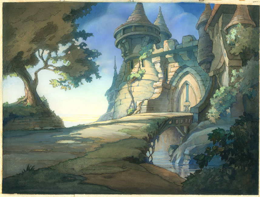
Well, let’s start off simply. Take a look at this background painting from the Fleischer’s studio from the early 1940’s. This was in a post on Cartoon Brew a few days back.

sm_fleischercastlebg.jpg

This is a fairly typical background painting from the time. I chose this image to start our comparisons with because it is actually rather literal itself. Yet even though this is on the literal end of the spectrum it’s still nowhere near as literal as a typical CG film environment. In this world we are presented with a wide variety of easily recognizable objects and elements. Yet the visual technique used by the artist to represent these objects and elements is not solely literal. Yes, certain objects and elements are literally shown. We do see a number of distinct leaves, bricks, roof tiles, blades of grass, etc. But we also see areas lacking specific form definition, areas of mere shape, color and brush texture that in and of themselves mean nothing. These spaces require the viewer to “fill in the blanks” by drawing inferences from other more defined forms. This image combines some specified literalism in strategic places with larger areas of abstractness while still remaining discernable. The specific literal elements steer the viewer toward drawing a rightful conclusion about the nature of the abstract areas. This combination of explicitness and abstractness combine to define the essence of the substance, form or elements present. Being an untrained hack (I never went to art or film school) I don’t know the exact term for this sort of activity, so I’ve decided to call this Abstracted Essentialism (if an established term exists please educate me via the comments).
The roots of my term can again be found in the definition of words. First, Abstracted-

tr.v. ab·stract·ed, ab·stract·ing, ab·stracts
1. To take away; remove.
2. To remove without permission; filch.
3. To consider (a quality, for example) without reference to a particular example or object.
4. To summarize; epitomize.

And Essence, the root word of essential is defined as….

n.
1. The intrinsic or indispensable properties that serve to characterize or identify something.
2. The most important ingredient; the crucial element.
3. The inherent, unchanging nature of a thing or class of things.
4. a. An extract that has the fundamental properties of a substance in concentrated form.

Essential is defined as

adj.
1. Constituting or being part of the essence of something; inherent.
2. Basic or indispensable; necessary: essential ingredients.

So to boil it down: Abstracted Essentialism (AE) is the visual vocabulary whereby objects, elements and forms are represented in a manner that allows undefined visual elements to mix with and draw meaning from specific visual elements so as to express the ontological nature of the objects or elements portrayed.

Whew!
In plainer English: AE is when you mix a minority amount of specificity in form with larger areas of abstraction to communicate the core essence of an object or element in a way that is not utterly realistic or literal but is still easily understood.

Now for a more extreme example, let’s go to another French restaurant…

lorenzo03_Lorenzo.jpg

This is a painting by director Mike Gabriel for his Disney short film Lorenzo. Looking at this image we see that there are all kinds of recognizable restauranty things here, but they are not at all literal representations of the objects. Some shapes are quite specific, like a few of the bottles behind the bar, while a good deal more are nothing more than mere paint strokes with no form. It’s their proximity in space, tone and orientation to the more specific strokes that implies their substance. The limited specificity (almost completely devoid of literalism in any form) combined with the viewer’s understanding of how the world really looks come together to give meaning to the more abstract portions of the painting. Taking this even further, here is a rain slicked Parisian street at night….

lorenzo02_Lorenzo.jpg

This is the height of inference, yet it completely works. All non-essential visual aspects of the world have been stripped away, leaving only the barest of specific hints combined with very abstract elements. Despite this image having no more than a few dozen brush strokes we immediately understand what it is. We don’t need the image to pedantically tell us everything about itself. We can bring our own meaning to it and immediately grasp what it means. Aw, what the heck, here’s another one. They’re too pretty not to look at….

lorenzo06_Lorenzo.jpg

To me the real power in abstracted essentialism is in its invitational manner. The viewer is invited to project their own understanding into the voids within the imagery. With the highly specified literal forms of CG no such invitation is offered. Rather the imagery explicitly states its every meaning to the viewer. The viewer is asked to appreciate the visual, but not participate in it.
Hopefully this helps explain my thinking about these contrasting methods for visually expressing specific objects or elements. As for what this means practically, I’ll expand my thoughts more in the next post or two.

Wednesday, August 15, 2007

The CG “Look”

As I’ve noted before I am enjoying my own little spelunking exercise with my Cg animation and art. It occurred to me that it might be beneficial to take some time to define what it is that I want to avoid. The tools, techniques, de-facto forms and visual styles of CG are so deeply ingrained into the mindset of most CG artists that I think it’s important to define them so as to more easily spot when they are creeping into my work. Plus I figure if I’m not quite sure where I want to end up on this little adventure at the very least it’d be good to know where I don’t want to go. And to be sure - while it is a big money maker and highly popular- the normal “CG look” is not a look that I’m interested in pursuing for the umpteenthousandth time in my career. Now before you get all up in arms I’m not saying the usual “CG Look” is bad or lacking artistry or has no value. It’s fine for those that wish to pursue that. I’m just on a different path, that’s all. You’re free to take your own path with blessing.
OK, caveats aside, just how do I define the “CG look” that I wish to avoid along this different path? It’s too simple to label it realism and it’s not expansive enough to say that the CG look is overly detail dense (both mistakes I’ve made before). A more subtle and sophisticated definition is needed. Perhaps this one will suffice…

One thing that CG has always been excellent at is expressing a thing (whether it be an object, a character, texture, light, shadow, movement) in a very specific and literal way. Even when stylized in form the tap-root of CG’s strength lies deep in the soil of specified literalism.
This of course begs the question- What do I mean by specified literalism?

Let’s look at these dictionary definitions for the word Literal:

Literal (adjective)
1. Being in accordance with, conforming to, or upholding the exact or primary meaning of a word or words.
2. Word for word; verbatim: a literal translation.
3. Avoiding exaggeration, metaphor, or embellishment; factual; prosaic: a literal description; a literal mind.
4. Consisting of, using, or expressed by letters: literal notation.
5. Conforming or limited to the simplest, nonfigurative, or most obvious meaning of a word or words.

And Literalism:

Literalism (noun)
1. Adherence to the explicit sense of a given text or doctrine.
2. Literal portrayal; realism.

And Specific:

Specific (adjective)
1. Explicitly set forth; definite.
2. Relating to, characterizing, or distinguishing a species.
3. Special, distinctive, or unique:

Specified being

tr.v. spec·i·fied, spec·i·fy·ing, spec·i·fies
1. To state explicitly or in detail:
2. To include in a specification.

So this is what I mean by Specified Literalism. It is the technique wherein there exists an overall exactness in visual representation. Objects, movement, elements, materials and substances -regardless of macro variations in design- are described using a visual vocabulary that is precise and generally not open to interpretation.

Example: A tree. To represent a tree using Specified Literalism you would make a trunk with an exterior of bark, branches that cascade in size inverse with complexity and tens of thousands of leaves. There may be any number of macro design decisions about the tree regarding it’s shape, color, species and proportion, but the visual vocabulary for representing this tree would be precise. To wit, a sampling of CG trees from films through the years:

Here we see literalism in not just the trees but the rocks, ashphalt, car paint, etc.

cars trees.jpg

This is a close up so excuse the wizard hat. The trees have different form and proportion and color, but their elemental representation is still quite specific and literal.
shrek trees colored.jpg

Same thing only with tropical tree and plants. These may seem stylized but having lived in a tropical environment for a little bit now I can say that these trees aren’t too far from what we see in nature.
mad_trees.jpg

These here with the cow are kindergarten-ized trees, very simplistic in nature, yet still specific and literal in expression.

barnyard trees.jpg

If you watch Geri’s Game closely you’ll see that Good Geri has yellow tree behind him and Bad Geri has red trees behind him. A nice storytelling touch. Still the trees are pretty literal outside of their color choices.
geri_tree2.jpg

Another example: A building or room. Using the language of specified literalism you would determine what base material of construction the parts of the building are made up of. Then you would go about creating specific material and shape representations to express these objects or elements. Again a myriad of macro design choices aside, the visual language of specified literalism denotes that each brick will be defined, every stone represented, every material rather faithfully recreated in order to express a building. Again, some CG buildings culled from various films:

Here we see decorative elements meant to add an alien-esque flavor to the otherwise very literal and specific building materials we all are familiar with. Looks just like Mars should look. Ahem.

ilion bldgs.jpg

Very specific and literal, yet artfully done.
rat bldgs 2.jpg

Again we see decorative elements mean to make this monster-esque but the materials remain specific and fairly literal.
monsters bldgs.jpg

Wonky angles, slightly off proportions and lots of literal glass, brick, grass, concrete, fur, etc.
mad_bldgs.jpg

Here the specificity of materials is downplayed (the concrete doesn’t scream LOOK AT! ME I’M CONCRETE!), but the forms are quite literal.
incred_bldgs.jpg

Fairly specific and literal take on your average American suburb
ab_houses.jpg

More alien-esque decorations and design choices laid over top of specific and literal expression of forms and materials.
ilion_bldgs.jpg

The metal shelled quansit hut, floor materials, etc. all very specific and literal
cars_bldgs.jpg

Nice art deco style in the form, very specific expression of that design.
cars_bldgs2.jpg
Another subject: Flesh. Regardless of species (whether real or imagined) to denote flesh in a specified literalistic manner you would be sure to include pores, wrinkles, body hair, blemishes, freckles, marks, scars, sub surface light scattering properties (a more recent technology) or other anomolies all with some significant degree of exactness. Again, examples…

Yes, green ogres don’t exist thus this is not ‘realism’. Still the flesh is represented in a very literal fashion.

shrek skin.jpg

The entire production design of The Incredibles values understatement in materials (like the building noted above). Even so understatement means it’s still literal, it’s just being whispered instead of screamed. Get out your DVD and watch those close up shots to see what I’m talking about.
incred_skin.jpg

Less whispering. The humans in the Shrek franchise have skin that is very literal.

prince skin.jpg

Lots of close up’s of Al’s skin perhaps dictated a more literal approach.

al-big.jpg

ab_skin.jpg

With Skinner we see more subdued literal elements of pores, blemish and surface, but the subsurface scattering is turned up. Note the lip texture as well- quite specific and literal. Still a fun design from the realm of proportion. He was my favorite character to watch in the film.
rat skin2.jpg

All the humans in the film have a very healthy application of rouge to the cheeks- except the Anton Ego character. Here we see the freckles thing.
rat skin.jpg
With all of these you can almost pick any substance and find the same visual law at work. Cloth, hair, atmosphere, etc. Certainly there are many variations of design, color, form and proportion at work- all evidence of artistic decision making. Again, I’m not saying that any of this is bad or lacking imagination or anything- I’m just examining the visual evidence to try and work out some definitions. There is lots of room for artistic license within this look. But even when presented with fantastical realms, materials, colors and things CG reverts to a specificity of form that labors to lend a specific sense of realistic-ness (not realism) to the work. Regardless of scenario, theme or topic the technique of greatest recourse is a specificity with regard to elemental accuracy. No significant attempt at material or elemental abstraction is made. It’s this lack of abstractness in the majority of CG animated film efforts that has defined the de-facto “look” of CG.

Sunday, August 12, 2007

Real life (and death) interrupts our fun…

It’s with a heavy heart that I report that a friend and former animation student of mine passed away last Thursday. Micah Eberhard, a young fellow of 20 years in age, died from massive head trauma following an automobile accident. Micah’s family live here in Cuiaba’ Brazil. His dad is a missionary who is working to translate the Bible into a native language for a small tribe in remote western Brazil. Micah grew up a missionary kid but always had a love of art. He attended SCAD in Savannah as an animation student for his freshman year, but left the school due to running short on finances. (Missionaries don’t make a lot of money, in case you didn’t know). Micah’s parents- good friends and sweet generous people- asked if I’d be willing to teach Micah some animation while he came back home to live and sort things out. I agreed and for the next 6 months or so I took time to train Micah in various skills, especially animation. He was one of those kids who had a real knack for motion and performance.

Earlier this summer Micah moved back to the U.S. to be near his fiancee’. He was living and working near her family in northern Ohio when last Tuesday he was hit at high velocity by another car at an intersection. He was Mercy flighted to a hospital in Columbus where he was in a coma. He lived another two days- just long enough for his parents to arrive at his bedside from Brazil. They had just visited him 2 weeks ago. Endings can come suddenly like that.

Stuff like this never ceases to remind me how silly alot of this animation business really is. I love animation, it’s my favorite unimportant thing in life. But I must continually remind myself- it’s not an important thing in life. As sobering as moments like these are I am thankful for the recalibrating affect they have on me. Someday we’re all going to meet the end of our path, whether it happens suddenly in our youth or unsurprisingly in our grey headed years. I believe our true legacy among those we leave behind will not be defined by how great our art was, but by how we treated each other. We’ll be judged on another criteria altogether. Micah put his faith in Jesus Christ as his salvation. He’s home and I look forward to seeing him again someday- along with many other friends who have gone on before me. A lot of folks don’t like to hear expressions of faith in public. That’s fine. Send me an angry email if you feel you must instruct me about how foolish I am to believe what I believe or how inappropriate it is to be so public with my faith. I need the entertainment. But I’m not ashamed of my faith in Jesus and I’m not about to keep it in a box, especially during times like these.

Those of you so inclined to do so, please pray for Micah’s family and his fiancee’. And if you’re wondering if there’s something you can do to help, actually there is. This surprise event will no doubt put a massive strain on Micah’s family’s finances. As I mentioned before missionaries don’t make a ton of money. If you want to lend a financial hand to help offset some of the medical, travel and funeral expenses send me an email via the contact form here on my site. I can put you in touch with a not-for-profit organization that can accept your donations on behalf of Micah’s family. I can personally guarantee that 100% of what you give will make its way to the family.

And remember, be good to each other.

Monday, August 06, 2007

Dangerous Opinions

Mark Mayerson has a pretty strong take on the Alvin & the Chipmunks project as well as Fox/Blue Sky’s Horton Hears a Who effort. All I can say to both of his points is- “Dang, it’s hard to argue with that.”. For me I knew the chipmunks thing was going to be a derivation of the Garfield efforts, so there was no surprise or disappointment from me about the thing. I’ve yet to see either Garfield film and I doubt I’ll see the Chipmunks as well. But the Horton trailer… boy. Talk about lost potential. That one left me a little sad. The earliest promo images were so tantalizing. They really did a great job with the production design and art direction, but it seems they totally fumbled the soul. And if there’s anything that always set apart Ted Geisel’s work it was the soul of it all. I began to have my doubts when I saw the first billboard for Horton, the one with Horton doing the shading the eyes scout thing from a tree. I saw that pose and thought “Uh-oh, he doesn’t appear to be acting like the Horton I remember from the book.” So at the risk of outing myself, I have to agree with Mark. Horton doesn’t seem to be working- for a lot of reasons. Speaking of strong opinions…

Over on the Thinking Animation blog there’s a post where Angie Jones (I think it’s Angie, I can never tell who’s posting. They need a by line like Cartoon Brew or Drawn have) anyhow - somebody - posted an anonymous thought about the relative career value for animators of working on a mo-cap film like Beowulf (or Monster House, Polar Express, Happy Feet or any other number of mo-cap-imated films that are popping up like weeds). Go read the whole post, but I offer here a quote…

These films provide work and steady employment, but do nothing for animators creativity or career expansion. There is little to gain in terms of skill set growth, or animation knowledge by working on these films….

Some folks try to rationalize”animating” on these films by figuring that they learn a lot about natural motion. But animation is not about natural motion, it is about caricature…

Bottom line, stay away from this work if you can, and if you must, then make sure to spend your free time actually animating and keeping your skills fresh and sharp. Because, in this fast paced animated world, your skills can quickly sink below the bar within the time you spend working on a mocapped film.

The name of the author of these raw thoughts has been withheld in order to protect their career- a sad but necessary precaution even though this person is not alone in their ideas. These are what you call Dangerous Opinions. Anybody bold enough to express them “on the record” and who is willing to put their name to them will often face a rough road in their career in film production studios- especially in CG. And the truth is that a lot of people in the biz think the same way as this anonymous animator quoted on Angie’s blog. (While I’m being dangerous, I’ll come clean and admit- I totally agree with this anonymous animator). Probably the worst thing you can do for your career (short of maybe punching a director in the throat because they asked for fixes) is to express an honest, real opinion about the merits (or lack thereof) of the work being done in the big film studios these days. There’s a reason this other highly acidic opinion is posted on a blog where the author remains anonymous. But I can tell you the honest truth that a lot of people in the biz hold that exact same opinion about this stuff. Artists are a sensitive lot. Anything short of fawning praise is sure to rankle somebody who has thin skin. (How such people make a living in an industry where your work is torn to shreds every day in dailies is beyond me).

So who are the people who come right out and say what they think- with their names attached? People who aren’t worried about getting another studio job, that’s who. People like Sporn, Mayerson, Amidi, Kricfalusi, Barrier, etc. These guys don’t really care if some sensitive animation supervisor in some big studio doesn’t like what they say about their work- they’re not looking for a job in these studios. Granted I don’t like a site filled with constant harangues about how anything done since 1950 is o good or anything done on a computer is no good or anything done by Dreamworks is no good. A site that is always ripping things down is as much of a cypher as one that does nothing but cheer-lead the industry. I just want some honesty. Some things are honestly really cool. Some things are honestly just a steaming pile. Most things are somewhere in between with a mix of both cool and steaming pile attributes. I’ve always appreciated a balanced view on things. Few things are ever as awesome as everybody says and few things are ever as terrible as people say they are. Anything but the company line is a welcome site to my reading eyes (it’s the tone that I like to keep here).

Folks who know me know I’m not short on opinions. It’s one of my tragic flaws in life- I have opinions and I am terrible at pretending that I don’t have them. I’m not very good at the politics of faking it. If I like something then I like it and it shows. If I don’t, well, then I don’t. And it shows. I’d be a terrible poker player. Much misery has come to me in my days because of this trait. I wish I could change it, but alas, I believe I am doomed to being utterly transparent. Thankfully this blog doesn’t always show my face when I see things and I have the luxury of editing my posts over time to temper my thoughts with some fabric softener. Still on my braver days I venture out into expressing some of my riskier opinions. Even so I’ve never really let loose. Why? Simply because I don’t know if I’ll ever need a studio job again. I’ve been burned by being too honest before- there are studios where I’ll never get hired and I know it. So I keep a lid on my most controversial thoughts and peck around the edges of things. In such an insular industry as film animation feathers ruffle very easily and grudges are carried for a long, long time. I have a number of half written posts in a folder on my hard drive labeled “Career Suicide”. If I ever posted them that’s exactly what I’d be committing. Maybe in time I’ll be in a better position, but since discretion is the better part of valor I think I’ll keep those thoughts to myself and only share them with friends whom I trust. Unfortunately anyone who wants to be sure they can get a job at a CG film studio would be wise to follow the same path. Either that or be sure to remain anonymous when you say what you’re really thinking.

Tuesday, July 31, 2007

A little home cooking

Obviously I’ve been doing a lot of studying, thinking (and too much writing!) recently about exploring different visual and motion styles for CG. (Or rather more properly “visual and motion aesthetics“- thanks to Erik for the nomenclature help). Anyhow, just to show that yapping my trap isn’t my only area of activity- here’s a little test that I cooked up this weekend. Just a little something that was fun. Maybe different?

attitudeClickToPlay.jpg

I puttered around for about a day on it- most of that time spent trying exploring different ideas for bringing the background to play a role in accentuating the performance. I have an earlier version with a totally different method for making the background plate, but I abandoned it for being too complicated to set up. Simple is the watch word here. The character rig is a freebie rig I downloaded from HighEnd3d.com, not my own creation (Although I did apply some different shaders that I made to get a different, non-literal look for it). I expect when I start using my own rig (it’s almost done) that I’ll be able to push the animation technique a bit further with regard to deforming the shapes of the character in motion. Obviously this isn’t the end of my efforts, just a stumbling step along the path. I’m not trying to emulate any specific animation style or medium. Rather I’m trying to borrow flavors from all different kinds of sources, all rolled into a (hopefully tasty) visual recipe. That’s something that I believe that CG is uniquely positioned to do better than any other medium.

But the best part was that this was fun for me to make. Fun is the ingredient that all audiences can taste. I hope that part shows through at least.

OK, I’m gonna take break from typing for a while. Back to the kitchen!

Monday, July 30, 2007

Kevin Langley breaks down Dan Backslide


The wonderful Goobersleave blog has a fantastic post today- Kevin does some slow-motion presentation of a few Dan Backslide moments (animated by Bobe Cannon) from Chuck Jones’ seminal short The Dover Boys.

I’m always surprised when people say this is an early example of ‘limited animation’. On the contrary I’ve always thought “The Dover Boys” represented a wonderful expression of what full animation could bring to the table. There is no pretense of literalism in this film- it is utterly, fully animated. The things that are done here could only ever be done in a fully animated world. An animator employing what is typically called ‘full animation’ (let’s say a Disney animator from the same time period) would have Dan Backslide walk from the passenger side of the car and go around the car and get in and sit down in the driver’s seat in literal movements and steps. The animator would proceed based roughly on how a person might literally accomplish the same movement. The good animator would bring a sense of entertainment, music, rhythm, life, charm and expression to this. But in the end the scene would require maybe 80-100 drawings to complete (give or take). In “The Dover Boys” Bobe Cannon manages to accomplish the same action in 4 or 5 drawings. The way he does it is, in my opinion, one of the greatest expressions of full animation that has ever been done on planet earth. The solution to the challenge wasn’t to pick 5 milepost drawings out of the 80 that the full animator would use. That’s usually how limited animation has been done, often with less than inspiring results. But this- this is something altogether different. This instead is the act of taking multiple drawings and combining them into a single one that is all about perception and flow in movement. It’s a masterful expression of what it means to understand how animation functions on the atomic level.

Speaking as a teacher of animators I think we now we labor under the opposite problem- too many drawings without a clear understanding of how to make many (any?) of them meaningful. CG animators have no poverty of drawings to work with. We’ve got our rigged puppets, we have our timelines filled with a world of free inbetweens and we have our limitless inbetweened previewing capabilities at the push of a button or the scrub of a mouse. Thus equipped we happily press forward. Yet the price we pay for such modern conveniences is that we don’t think in terms of how images & drawings can express motion. Sure we pay some grudging tribute to the idea in our ‘blocking’ but then happily dive into the world of free inbetweens and endless scrubbing twiddles as soon as we possibly can. CG animators tend to discover their solutions as they go as a result of innumerable previews and tweaks over time. When every frame and drawing is given to you for free you don’t really understand the power of each one. Ours is a soft-minded way. Take away our ability to rip off 10, 20 or 30 playblast previews a day and some Cg animators would literally freeze up. When we learn that in the old days animators were lucky if they could pencil test their scenes once before turning them in we’re incredulous. Once? Seriously? Many of us can’t fathom such a way of working- and I think our own work suffers for it. A lot of animators who’ve only ever worked in the CG medium don’t understand the guts of how animation works well enough to know how to accomplish something like The Dover Boys. I know I didn’t when I first saw it and I was already a working professional! When I first tried to study this Dover Boys film it was like some kind of dark magic to me. — How could they do that? How would they even begin to know how to do that? And with pencils and no timeline to scrub around in? Surely this stuff must have taken months to make, right? What?! They did this at 15 feet per week?! No way! — These were the questions that echoed around my cranium when I first started analyzing this cartoon ‘lo these many years hence. It’s been a long journey for me since. Each time I’ve ever shown The Dover Boys to a group of younger CG animators (usually already working pros not many years out of school) they lose their minds in a similar sort of fashion. Like me they’re beside themselves- many had never seen anything like this. Or if they had seen it they’d never stopped and studied how it was accomplished. They could never fathom that getting from point A to point B in a scene in 5 frames was even possible, much less how to do it. This isn’t a knock on anybody- we only know what we know. We only have the experiences we have and we learn the way we’ve been taught. To this day most CG animators are still animating in some adaptation of the way computer programmers thought animation should work two decades ago. Of course the current rigid puppet rig paradigm hasn’t allowed us much freedom from this. Nor does the status quo for the technology give us a lot of room to employ this smear technique in CG. As a result some may dismiss this as an academic exercise or the grumblings of an old crank with an axe to grind with CG. “Stop harping on the past, get with the times.” That sort of rot. But remember, I am a CG animator- I really think the medium has untapped potential, and as such I think this is something worth exploring. When I initially studied The Dover Boys I experienced some of my first glimmers of understanding about what I call the ‘guts’ of animation. I began to see that one of the core secrets of excellent animation lay in the power of the drawings chosen to represent motion. Since then I have had several other major influences to thank for showing me that this is true regardless of how you make those drawings, whether you make them with a pencil or by pushing a puppet around on a computer.

But back to the cartoon- sadly the practice of employing this smear technique seems to have been mostly a one off experiment with not much further extensive use even among Golden Age cartoons. True enough it was used in spots throughout the years, but I don’t recall any single cartoon or film that embraced this technique so boldly (or to such great success). Which is too bad, really. It’s really interesting once you study it. Most big moves can be described as 3 drawings where the motion is broken out as 15% 70% 15%. Occasionally for larger moves you’ll see a four drawing move with a 10%, 40%, 40%, 10% sort of thing going on. The percentages are my loose way of defining how much of the motion for an action is represented in each specific drawing. The real genius of those ease drawings is of course in having some parts of the drawing be 95 or 98% of the way to the next pose while other parts are still dragged back at 60 or 70%, but that’s getting pretty technical. The cool thing is that even though there is a kind of motion formula at work here, all you need to do is to string a few smaller moves like this together with some stillness between them for rhythm and you can get great texture in the motion. The scenes of Dan Backslide “running” up to the cabin door to open it are fantastic examples of just how far you can push this technique and still have it hold up.

DBackslide-7.jpg

An example of 75% of the motion all wrapped up into one drawing.

A big huge thanks to Kevin for taking the time to break this down and put up examples. It’s like a clinic for free. You all should be reading his blog.

Friday, July 27, 2007

Right on cue….

Aardman releases a couple of online clips to their recent short film The Pearce Sisters. Go see ‘em!

boat_bg_sml1.jpg
It’s fantastic! I love it! I’m jealous of the creativity here. The mixture of CG and traditional medium is great- the solution for the water is imaginative and seamless. I love that they spend so much time lingering over the quiet, dull moments of the sisters’ daily life. It brings a charming pace and texture to the work. As they say over yonder -”Brilliant!” I want more!

edit: I forgot to mention I got wind of this via Steve Ogden’s ever nifty Animwatch Blog. Steve does solid work with his AnimWatch site and it deserves a good plug.

Thursday, July 26, 2007

The Fool’s Errand, Part 3

foolhat.jpg

In my previous post in this series I related how I’d gotten stuck in my own quagmire of a short film production. The source of this Slough of Despond was the amount of work I had set up for myself- a noble if somewhat Quixotic venture. You see, way back when I started this thing, I had fallen for a false value statement. I believed the myopic industry hype that there is really only one way for great CG animation to look- namely the uber polished, highly detailed and technically impressive big budget feature film style. Anything that wasn’t that style was “good for what it is”, but it wasn’t really good. It was good* (with an asterisk). To rise above such a terrible fate I determined that the drive for my project was to show a mastery of a technique or a style. As a result I got caught trying to craft a short film that could stand up to the visual style and standards of larger CG feature film projects.

But why did I believe this in the first place? I suppose the answer to that is found in why any of us would believe it. Clearly many folks in the business (or who would love desperately to be in the business) believe this. Some in the film biz have a self interest in perpetuating the myth. It keeps them on top of the mountain with all the wannabes looking up, drooling, clambering to climb that same hill. Perhaps we believe this hype out of a misguided need for affirmation, to be considered part of something exclusive, something with meaning. Too many labor under the pretense that until they work at Pixar (or insert name of your favorite studio here) their animation careers and efforts are invalid, inferior and without full expression. If we’re honest most of us would have to admit that we all believe this same thing at some point in our animation walk. Many of us still do. Thus the need to do something “on that level”. To prove something to the demo reel watchers in the ivory towers of film studios. My previous short films didn’t show this- they weren’t made to be demo reels but were intended to be films. Thus the animation in them wasn’t the most polished stuff in the world. Fine for a short, but it wasn’t going to do the trick in convincing people that I could animate “at the highest level”- whatever the heck that meant.

I determined that I had to show that I could do feature film quality animation. So I would pull out all the stops. As to why I chose a short film to do this I haven’t the faintest idea. Perhaps because down inside I really enjoy making short films more than doing “just” animation. Whatever the reason I decided that this project was going to be the one that showed that I could pull off that high polish style. Of course at that moment the Fool’s Errand was in full stride and almost four years of lunacy have since transpired.

Of course I eventually did end up doing film animation, but the short film project that I thought would serve that end didn’t get me there. Instead what got me doing film work was a demo reel of solid, professional work. In effect my career had eventually spoken for itself and I didn’t need to prove anything with a short film.
But a funny thing happened on the way to my career goal- or rather in obtaining it. I found the highly polished film style of work was –I hesitate to say it for fear of offending– boring. What I mean is that the actual making of that style of animation doesn’t get me all excited. It’s just not as much fun as putting out something fun and energetic that has a few rough edges to it. This isn’t to say that the highly polished CG film style is bad. It’s clearly not. It’s just not my favorite style of animation to actually sit down and animate. But even with personal style preferences aside, I’ve come to see that the highly polished CG film style of animation is not any more the “best” than anything else. To return the charge: It’s good for what it is. Like all styles it has its place where it works well. But I don’t believe that there is one single “best” style of CG animation. Just lots of different good styles. The key (for me at least) is to be about doing the one that works for me, the one I enjoy. I remember when I used to smile at the stuff I made while I was making it. I’d like to do that again.

Which is why I doubt I’ll ever finish the space man short. It’s too much like the boring work I don’t like to do. If I’m going to animate in my free time I’m gonna have fun. I’m not going to do a style of animation that bores me just to prove a point that I no longer believe is valid. Maybe some day I’ll do something with all those assets. Who knows? But for now I’d rather do something fast and fun.
What are the lessons that I learned from this story?
First, don’t make a short film to try and get a job as an animator in feature film. That’s what demo reels are for. I’m not saying that a short film will never get you a job. Enough people have gotten work from their student films to prove that this isn’t true. I’m just saying that I believe that making a short film should be about the experience of making a film, not getting a job as an animator. If you happen to get work from the short- fantastic! But don’t make a short just to get a job.

Second, don’t allow the narrow-mindedness of others to narrow your own mind. Open your eyes to what is possible. There’s more than one style or design that is “good” or “great”. Don’t let the style hegemony of the current feature film market dominate your thinking. Somebody very bright and very confident decided that Pocoyo was going to have a different, fun style of CG animation. We’re all the better for it. Who will make the next Pocoyo?

Third, don’t make your film to impress industry types. Make it to entertain audiences. Or entertain yourself at the very least.

But most of all have fun or don’t do it. In the end I think that fun shows through in the work. Let the high brow types pan your short film for its animation “flaws”. Audiences can tell when you had fun. That often more than makes up for the rest.

Tuesday, July 24, 2007

The Fool’s Errand, Part 2

Wow, 10 days since the last post. As you might have guessed I’ve been super busy, but I didn’t want to let this topic die just yet. In my first post on The Fool’s Errand topic I noted how it’s not all that feasible a goal to try and imitate the bigscreen results in your personal short film (especially if CG is your medium of choice). There’s been some great discussion in the comments, so let’s hope we can keep the conversation rolling. In this installment I put my cards on the table to demonstrate why I believe what I do about all this.

murrayPlanet_002.jpg

This is a test render from a short film that I had been working on for about 4 years in my spare time. This was an early “look of film” concept test, done sometime in the summer of 2004.

clickToPlayTest.jpg

This is a rendered push in on the character in the set. Caveats: It’s rough, the animation is totally scratch (as in Definitely Not Final) and there are some render glitches (flickering shadow maps, etc.). All par for the course for an early test.

clickToPlayWalk.jpg

And from way back in early 2004 is a walk cycle test with the original version of the character design and rig. The reason it plays all stuttery is because it’s 12 fps. My early tests are often on 2’s to keep things light and simple.

Here are some other test renders as well as some boards from a sequence from early on in the short… (click on each to see bigger)

caveInterior.jpg controlRoom_ambOcc.jpg hallway_RedWhite.jpg

murrayRoom_Blue.jpg murrayRoomShelf.jpg contactSheet.jpg donut.jpg stalagmo.jpg iDot.jpg rocket.jpg

boards_01_sm.jpg boards_02_sm.jpg boards_03_sm.jpg

As you can plainly see this stuff nowhere near as detailed or lush as the Ratatouille scenes mentioned in my previous post. There are all kinds of style and design deicisions in here meant to keep the workload as manageable as possible. I consciously chose to work from simple sit-com type stage sets. Most sets don’t have a fully built 4th wall. In addition I was careful to not overbuild things that won’t be seen up close. I had no plans on building a set so completely detailed that I had total camera freedom without fear of showing the technical uglinesses that come for free in CG (model faceting, low texture resolutions, crawling shadow maps- all computationally and laboriously expensive to fix). The shots were already in mind when the sets were built. Additionally I consciously chose color and lighting schemes that were roughly monochromatic, thus reducing the demand for highly detailed textures to give objects their sense of meaning and presence.

On the technical side I borrowed some techniques I’d learned in the film biz. I developed lighting rigs and production tools that would allow me to quickly block in my lighting - all while automatically taking into consideration which set or location the character was in. That would speed up baseline lighting and allow me to focus on finer details. Render scripts were developed, again to automate a lot of the gruntwork of getting images out. Compositing scripts and recipes were also created, as were color correction recipes and widgets. Animation wise I’ve got my library of various tools that built up over the years to help me move quickly. A pose library tool was adapted to allow me to quickly block in broadstroke foundational poses for detail areas like fingers and faces, again allowing me to focus my time on working the details and finer subtleties rather than build everything from scratch.

In short, I used every trick or technique I’d ever learned in the biz about how to streamline production without sacrificing quality. I just built smaller, home versions for my own use. There wasn’t a single area of production where I was not leveraging my many years and many different kinds of studio experiences.

Yet even with all of these design and production shortcuts I was doomed. The amount of work was too much. I bogged down. Animation tests revealed that the character rig wasn’t going to hold up. Skinning fat characters that maintain good volume but are still flexibile and have the ability to be pushed to some extreme poses is perhaps one of the hardest rigging tasks in the business. This rig had 60+ pose deformers just on his hips and belly to maintain proper volume and it still was not enough. It was looking like a bag of grape jelly in even moderately extreme poses and motions. Seeing as feature film quality was the standard and The Incredibles had totally redefined what the bar was for this kind of stuff I had to completely rethink my approach. I started to see that a muscle & fat simulation solution was going to be the only thing that would make him look right. After some messing with Michael Comet’s cMuscle system (I still had my old beta testing copy lying around) I saw that I could do it, but it’d take me a year probably to get it right. It’s at that moment that I said Enough. I’d already rebuilt the guy 3 times over the previous two years. It was too much. And it’s not like I could throw him away and go with a skinny guy because so much of the short’s story was built around his bumbling, fat, clumsy and slovenly ways.

Aside from the rig problems, there was the sheer workload of the animation. The animation was going to be highly polished film level Cg work- something I have experience doing and can do pretty well. But that takes time. Even though I work fast the best I could hope to accomplish for my own film would be 2 or 3 seconds of final, full, CG feature film quality animation per week. I lacked sufficient man-days to do any more. To do a minute would take me 6 months of animation. To do the full 8 minutes for the story would take three and a half, maybe four years. Pre-production had already cost me almost four years. Re-working the rig for the fourth time would take another 8 months or more. I haven’t even mentioned lighting, FX, rendering, compositing, sound engineering, music, etc. In effect I had chosen a style of animation and design that required far too much labor.

I fell into the trap and the technique was the goal. I was trying to match the visual tones of a larger film production all on my own. And I wasn’t even trying to match that level of detail exactly. I did make plenty of compromises along the way. Yet even with all that I was still left with a project that was easily 10+ years from completion.

I know, I know. Shame on me. But understand- I could do the job. I could do it all well enough to make it work. I wasn’t on track to embarrass myself here. Yet I learned a very hard lesson in my youthful exuberance: Just because you can do a thing doesn’t mean you should.

In another post I’ll explain why I made this doomed choice in the first place.