Saturday, December 29, 2007

My favorite Animated film of 2007?

2 months without a post. Yikes. I’d tell you why, but that’s a story too long (and too personal) for this space right now.

But hey, since we’re rolling up on the end of 2007 I figure I’d weigh in on what was my favorite animated film of 2007 (the only rule here is that it be a film I actually saw). My pick?

Surf’s Up from Sony Animation.

surfsup.gif

Why?

  • The water is a technical marvel to behold. The more I watch it the more impressive it becomes.
  • The production design is fun and beautiful to look at.
  • The conceit of the film is imaginative (penguins invented surfing, documentary stylings, etc.)
  • The acting was some of the best in a long while. Understated, but really, really strong. Normally I like my animation to be classic cartoon fun (Jones, Avery, etc.) but the subtlety of the voice performances were really rich. The animators really took that lead and ran with it in a style that I found engaging.
  • The core message of the film spoke to me in a way that I needed to hear. Namely this: Loosen up, dude! This stuff is supposed to be fun. So let the business and the stress and the go-getter side of things slide and just enjoy the ride with thankfulness, peace and joy. It works for surfing, it works for animation and I’m learning that it works for life itself.

I’m praying for a fabulous, safe and joy-filled 2008 to everyone out there. May we all learn the strength and value of faith, family and friends. God bless!

Friday, November 02, 2007

Exuse the dust

We’re trying to upgrade the blog so that it is more secure (there has been a rash of virus warnings and such related to the site the last month or two). Things aren’t going smoothly at the moment. Par for the course. Still, what can you do but smile and keep trying?

Friday, October 26, 2007

New animatic

In version 1.0 of TSJOM I had a story reel animatic that ran roughly 9 minutes. Looking back at that original (actually 4th edit of the reel) that I was using as my ‘locked pre-production reel’ I see how I have grown as a story teller since then. The old reel had lots of rather pedantic shots that were exceedingly sequential and needlessly expositional. Too many small actions given too big a place in the narrative had a soporific effect on the pacing of the reel. (ie: it became slow, plodding and sleepy). I guess back in 2002 (when I made it) I felt that I needed to justify all of my story choices with full visual explanations of actions, reactions, events and consequences. These are indeed the core tools of story telling, but I didn’t leave a lot of room for the audience to ‘fill in the blanks’.

Thank heaven for personal growth, eh?

In version 2.0 I am currently working on a new story reel animatic. Now I am working to produce the film to a track of music that I am currently negotiating the license to. This marks a significant change in how I approach the story. The music, with some editing here and there will make the film less than 4 minutes in length. So the current task is seperating the old wheat from the chaff, tossing pedantic literalisms in the story telling and strengthening the core kernels of the idea. Making it all work on a 14 beat music timing only adds to the fun.

Tutorial translation- Breakdowns in Chinese

Thanks again to Victor Luo we have another tutorial in Chinese. My tutorial, Breakdowns Can Be Such a Drag, has been translated into Chinese. So if you’re into Chinese as a language (either for sport or for profit) then feel free to head over there for a look and say a word of thanks to Victor.

I’d say something funny if I could think of it,
but I left all my funny thoughts in my other suit.

Thursday, October 18, 2007

Rough stuff

I first want to say ‘Thanks!’ to everybody who’s commented so far. It’s a big help to know folks are pulling for me while I try to make this film.

A few folks mentioned that they thought the new style of the paint animation was maybe a bit “too much”. I do appreciate the feedback and I can definitely see where they’re coming from. In fact I felt the same way years ago when I first started working on the film. But I’ve changed, thought through things more. Now if I hear that it’s a bit too much I reply: “Great! That’s just how I want it!”.

Going waaaay back to the very beginning I experimented a good deal with a painterly style I made this one short test that I felt was pretty solid. But something happened as I started to make the film with that render style. It seemed forced. I think this is because at the time I valued specific, smooth, tight animation over emotional expression. After all I’m supposed to be a good character animator, right? It’s something that I think all Cg animators stuggle with (and perhaps many hand drawn animators struggle as well)- the desire to achieve a high level of technical accomplishment, detail and polish as the primary metric for quality. (I’ll call it the Jungle Book Syndrome. Amazingly accomplished animation wasted on a nothing of a film. Heresy, yes, I know. The line for stoning forms to the left. Be sure to upgrade to the extra sharp rocks, folks!) Being a character animator I wanted to have smooth and clean character animation that wasn’t distracted by some rendering effect. The result was to animate on 1’s with lots of fun little details.

However there was a disconnect that I was feeling between the motion and the rendering. When I watched the rendered scenes with a rough painterly style the animation had a feeling similar to live action run through a bunch of photoshop filters (can we call this the Linklater Style yet?). There was a lack of cohesion. The rendering was expressive, the animation motion was more illiterative. The rendering was calling for something a little less polished. But conventional wisdom (and my understanding of animation at the time) says that good animation is polished animation. So unpolishing the animation couldn’t possibly be the right thing to do. So instead I over polished the painted rendering look, toning it way down.

Now I believe that less literal rendering styles work better using less literal motion styles. That means that if I am going to express a sense of emotion with the rougher rendering then all of those precious little Pixar inspired animation efforts would get lost in the shuffle. So for Version 2.0 0f TSJOM I decided to throw out all of my little animation goodies for the betterment of the film as a whole. There needs to be a balance in all of the ingredients, especially if that balance is a little on the rough side.

From a story standpoint it’s very important to me that this film be rough around the edges. In some way the film speaks to the homegenization of life in modern culture (but not exclusively to this). We’re losing our sense of adventure, our sense of connectedness to dirt, sweat, pain, joy - life. We choose the aenesthitized mediocrity of the branded homogenized life rather than run the risk of being inconvenienced, failing, getting dirty, sweaty or hurt. We choose the safe, the mediocre, the easy (and often the overly expensive thinking that this buys us security). But we also trade in the opportunity to find something new, the out of the way treasures, the different, the amazing- in life, in others, in ourselves. This creeping standard of polished mediocrity infiltrates every area of our lives. Where we live, how we move around, what we wear, what we eat, where we work, how we educate ourselves and our kids, our healthcare, our finances, how we spend our leisure time, our faith, the kinds of people we socialize with - and for those of us who animate, even the style of our animation- all are getting narrowed down to the muddled middle of safe, standardized life. Meanwhile our world grows stale, small and petty and our ability to tolerate that which isn’t juuuuust so wanes- but the grass was always perfectly cut and the stores are clean and (most importantly) we fit in.

Here in western Brazil Dirt is a daily friend. Sweat is Dirt’s little sister and she’s always around. Inconvenience is their tag along buddy. Here life isn’t quite as ‘managed’ as in the states. It’s less polished by far. And while that can be annoying at times, I never doubt that I am alive and connected to this place. Each day I find something that really stinks (sometimes literally!) and something so cool and amazing that I’d never find in my old life back in the U.S. So for me it’s important that TSJOM speaks to this.

Tuesday, October 16, 2007

The Secret Joys of Myopia — back in production

You can’t keep a good film down.

I’m very pleased to announce that I have resumed production on my short film The Secret Joys of Myopia. For a taste of what it could look like, have a peek at this new “2.0″ version production test.

myop2_testClickToPlay.jpg

Longtime friends and followers of my site may be familiar with the turbulent history of this short film (for those who aren’t, don’t worry, I’ll be writing to fill you in on the history of this project). So it’s a real joy to be able to resume work on it. I really believe in the story, more so now than ever before. And after a few months of trial and error and exploration I have finally found a production friendly way of capturing the expressive painterly look that marked the original. Meaning, making this film won’t kill me. It’ll just hurt me a little. Which is cool, that’s the way it should be. Anyhow, I just felt like the time was right to make this thing finally happen.

I will be posting a lot about the production of the film here on my site. In fact the “plog” (production blog) of TSJM might just dominate much of my writing here for the next few months. Which might be interesting. Or not. Heh.

Thanks to everybody for their support and their kind words. I’m hopeful that I can deliver the goods in a way that exceeds expectations.

And so, game on!

Sunday, October 07, 2007

Took a break…

Wow, been a few weeks since I’ve posted here. The usual excuse applies- I’ve been very busy doing other things. Some of that busy-ness is animation related (more on that this week), while other stuff has been water filter ministry related (more on that as well). I’m weeks behind on my email, too. Go figure.

Anyhow, stick around and we’ll have some really fun stuff soon- with pictures!

Saturday, September 22, 2007

Over the Hedge (Fund)!

In my last post, Kat Evans commented

My goodness Keith, if I didn’t know better, I’d say you’re becoming an economist on the side.

You don’t know the half of it, sister! Heheh. Here’s even more “economist-speak” from me.

Hollywood relies on an ever revolving door of suckers to finance a lot of their films. Hollywood studios are no dummies. They only put their own money into films they have reasonable confidence will return that money. But they also have a slate of films that they’re not so sure about but still think might turn out OK. Films like The Ant Bully (seemed like a good idea at the time). So a studio like WB looks for somebody to to help pay for it. When we were working on The Ant Bully at DNA we all noticed a tag at the front of the trailers for “Legendary Pictures”. A lot of folks in the studio were like “Who are they? We’ve never heard of them before. Why do they get their name and logo on the front of the film and DNA doesn’t?”. Well, “they” are a large source of financing to a portion of WB’s film slate. (here’s a slew of links for your own investigation). Investment wise for the financiers sometimes the gamble works (Batman Begins, 300), sometimes not so much (Superman Returns, Ant Bully, Lady in the Water). Legendary Pictures is the invention of a Wall Street hedge fund (MC Venture Partners). Hedge funds are the investment playground of the rich and anonymous. Hedges are always seeking out higher returns than you can get by just sticking to the S&P Index.

Hedge funds are an intriguing beast. They’re exclusive, usually only allow in high dollar investors and promise amazing returns. They’re like uber-investments. Most of them use a bunch of super sophisticated MIT built math models to play market volatility and risk to their advantage, so as a result they seek out risk rather than avoiding it (no wonder why they’re involved in making films!). They place offsetting bets on things doing well and things not doing well according to the statistical “norm”. So far sounds good, but they do even more. They amplify this earning power by using investor’s deposits as collateral to borrow money from other places (banks, securities firms, pension funds, foreign governments, etc.) and invest that loaned money as well. Then they use the investments from that borrowed money as further collateral to borrow ever more money and invest that as well. It’s like a rising spiral of loans- all using the previous investments (bought on credit) as collateral for getting a new loan. For every $1 that an investor has deposited into a hedge fund a typical hedge will borrow another $10 and invest that as well.
Anyhow, because they have all this borrowed money to invest these hedges have been looking for places - anyplace!- to put it to use. One place they have rolled their dice is with Hollywood (where the math models seem to have figured out how to parlay the winners and losers). Legendary is just one example of many of these kinds of investment vehicles financing films. Hedge fund money is helping to get a lot of films made. (Google “hedge fund investment in Hollywood” for interesting reading)

Sounds like a wonderful game! Indeed it all works like Christmas when the world plays along with your ‘normative’ math models. When things don’t ‘follow the norm’…. well, let’s just say it can get messy.

And right now things are getting a little messy. Hedge funds are taking a beating these days. Seems there was a problem in their math models. This little problem called “sub prime mortgages” aren’t playing by the “norm”- they’re defaulting at much higher rates than the math genius experts thought they would. And if that weren’t enough, now alt-A and ARM mortgage defaults are going off the norm, too. Hedges have a boatload of borrowed money tied up in these mortgage backed securities (to be honest everybody in global finance does. I could fill three full posts on this mess). Several hedges (and a UK bank) have gone belly up already and economists expect more to do the same as the housing bust in the US goes deeper and these exotic interest only, teaser rate, adjustable rate, reverse amortization, ninja (no income, no job) loans go flop.

End result? Lotso’ these hedges gots’ no money to repay the loans, repay their depositors or to do anything else (like invest in films). This is amusingly referred to as ‘bankruptcy’. And there are a bunch of these hedge funds that could unwind in a very messy manner in the next 12-18 months.

What does this mean for Hollywood? Well, the money might dry up a little bit. Not totally of course- there will always be another sucker. But when you add in the looming WGA and SAG labor tensions we might find that in 2008 and 2009 things may be a wee bit tight in Hollywood. As for animation, players like Disney/Pixar, DW and SPA are all in with their own cash. But the secondary markets for VFX work and lower budget second tier animated films might get squeezed. Or maybe not. But I wouldn’t be at all surprised if things slowed down some beginning next year. It’s not like any of this is especially new. The film biz has always been up and down- animation even moreso. Folks who’ve been around for a while understand this. But there’s a lot of younger folks in the game now who have never seen a down cycle yet. Perhaps they believe such a down cycle will never come. Ah, the innocence of youth. Heh. At any rate, regardless of your age if you’re in the animation biz and you’re not regularly saving a chunk of money each month to get you through the inevitable rough patches then you are playing with fire.

Tuesday, September 18, 2007

Whither Canadian Outsourcing?

On a completely different track than I normally take here…

As many folks in the business know a lot of production has been outsourced to Canada in the last 20 years or so. This is true not just for animation, but for live action films and TV as well. Vancouver and Toronto have healthy animation industries, much of it built to service outsourced TV and DVD work coming from the US. Andecently we have even seen the production of two feature films being done in Vancouver. The normal attraction for this has been (as always) cost savings. The Canadian dollar has historically been rather heavily discounted against the US Dollar. Additionally the Canadian government isn’t shy about offering tax incentives and subsidies to studios to attract the business from the south. When the US Dollar has been strong this has been a win-win for US and Canadian studios (though not necessarily for US based animation artists. Folks who used to work at Big Idea know what I’m talking about).

But what happens when the US Dollar isn’t strong? This week the Canadian dollar has been living at about 95-97 cents against the US dollar. For most of the time since the mid 90’s the Canadian dollar has averaged between 65 and 75 cents against the US dollar. (now you see why production went north- a 25-30% savings on exchange rates, plus the tax incentives). This year alone the Canadian dollar has gained over 10% against the US Dollar. In other words- the Canadian dollar has almost the same value as the US Dollar. Suddenly that outsourcing isn’t quite as profitable as it used to be. There are still the helpful Canadian tax incentives, but still. That 25% currency savings has pretty much evaporated.
So what will this mean for the outsource dependent animation industry in Canada? Will they lose more and more production to India? Hard to say for sure, but if this weak US dollar position persists (and many economist believe it will for some time) animation folks in Canada might be seeing some work dry up.

Saturday, September 15, 2007

Doodles with Bryan Ballinger

Back when we worked together at Big Idea, my good friend and collaborator Bryan Ballinger and I would pass the time by drawing funny characters on post-it notes - usually with a sharpie pen. While we engaged in this activity almost non-stop, the primary place for this activity was staff meetings. For reasons that I don’t recall, we had lots of staff meetings back then. So, naturally, Bryan and I had lots of post-it note doodles. “Lots” as in, oh, say… thousands. A small subset of which made a fine wallpaper for my desk at the studio. Bryan has an enormous gallery of his many drawings - most of these made since he left Big Idea. Me? I still make the drawings- I just don’t keep many of them. I’ve never really valued my doodles much.

Bryan and I are, by admission, “not good” at drawing. Neither of us will have our work mistaken for that of another good friend of mine, Mark Behm. I think he’s just more comfy with that reality than I am.

Well, it’s been nearly 7 years since I sat in a staff meeting with Bryan and doodled. Bryan lives in Huntington, Indiana now, working as a professor. Me, I’m here 8,000 miles way in western Brazil. Doing… other stuff. We were on MSN the other night and for some reason I felt like sending him a doodle or two. Soon he responded and, well… just like old times. Here -in order- are the results…

I fire the first salvo- a rusty impersonation of a Bryan Ballinger styled doodle (I used Photoshop and my Cintiq- my scanner’s busted so I had to forgo the Post-It note sharpie combo)…

bBallHack.jpg

I try another imitation, this time trying to work in the infamous Ballinger tongue technique. Not so successful…

bBallHack3.jpg

Bryan reminds me that his tongues are rarely angled. I take note. I try one that I know I can hit out of the park- a striped shirt quasi animal looking thing— wearing a tie. A true Ballingerism is that in his universe only pigs or total dorks wear ties- and they’re always big fat, thick ties from the 70’s. No slim, stylish numbers.
bBallHack2.jpg

Now I’m cooking with gas. Bryan fires back….

bbtemp01.jpg

Nice- a monobrow! Note the tie. Striped, of course. See? I told ya! And another from him…

000629.jpg

Aww, she’s cute! We settle on the following equation: No nose = Cute. Flowers help. Encephaly apparently offers no draw backs.
But he says he’s been trying more sketchbook portraitures lately…
000612.jpg

What’s this? It’s like… almost real artsy looking. Feeling the need to reign things back in I respond with another goofy one, but one that is a little less of an imitation of the Ballinger look

bBallHack4.jpg

All agree, the fuzz-stache is the piece de’ resistance.

Another portrait from Bryan and a self portrait as well. I’m not sold on the big upper lip thing in the self portrait. He argues that indeed he has a “delicate underbite”. That’s…. creepy.

000614.jpg

bball01.jpg

OK, time to bust out my own riffs.
langoish.jpg

Bryan’s turn…

000623.jpg

He has a thing for dogs. Next up from me…

langoish2.jpg

Another Bryan salvo..

000625.jpg

Sweet! My turn…

langoish3.jpg

To which Bryan replies “Oh… now this is something else completely!” I toss out a few more quickies. First up, a portrait of our pastor here..

langoish4.jpg

Then I something else.
langoish6.jpg

Bryan wraps things up with a classic…

000590.jpg

Always end on an up-note.

Looking over the sheer enormity of Bryan’s gallery has inspired me to keep my silly doodles. I do a bajillion of them. I just never scan or keep them. I’ll try and change this.

Wednesday, September 12, 2007

The Tyer Debate

One animator who seems to be gaining favor long after he hung up his pencil is Terrytoons’ Jim Tyer. Some folks absolutely love him. Others think he’s a total hack. Thad K. - a big Jim Tyer fan- put up another Tyer clip on his Animation ID blog yesterday. Here’s the clip (in case you haven’t already seen it)

Cartoon Brew picked up the conversation today. The comments in the Brew post show the gulf between the lovers and haters of Tyer’s approach to animation.

Those who don’t like his work…

I ‘d argue(based on that example) that he’s terribly inept as an animator. The animation is so off model it’s like he did it with his eyes closed. The lip sync is also pretty bad, as well as the comic timing.

I agree with the first half of the article: the animation is wrong, sloppy, and way off model.

And those who do…

Tyer proves there’s much more to animation than being on model and in sync.
That walk near the end of the clip is insanely great.

The vaults are full of neat and on-model cartoons, and they are boring. Literal minds may accuse Tyer of many things but not boredom, that cardinal sin of filmmaking.

My take?

I think Jim Tyer should be celebrated, if for no other reason than he provided an striking, engaging and successful counter-point to the over tight Disney style hegemony. It’s as if he was trained by a witch-doctor on some tropical island and was dropped into the world of animation with a way of animating that was completely foreign to other animators (and against the “rules”)- yet so much fun for audiences. You never get the impression that Tyer wanted to show off his fine art skills. Many detractors say he didn’t have any. Even so his inbetweens show a masterful grasp of the power of shapes changing over time to represent more than just motion, but energy and a thriving sense of life. He could see things working out in motion that apparently nobody else could. Looking at his drawings by themselves you’d never think they’d work- but they not only work, they excel! He was the pure antithesis of the overly polished smoothness seen in much of western commercial animation. He seemed to thrive on the idea of showing something underneath the motion. His motion wasn’t motion- it was an explosion of a whole mix of things. He entertains with no apology for form. A slap-dash factory like Terrytoons was actually the perfect place for a guy like Tyer. He was a huge footage producer, which means he did all this crazy stuff without too much suffering and angst- he pounded it out like pancakes. He’s living proof that one doesn’t need to work at “Insert Big Name Feature Film Studio Here” to be validated as a great animator. Some guys would be utterly wasted in those environments. The Jim Tyer mold of animator works best not as a cog safe in the womb of the larger collective, but out in the wild and woolly world of low budget where one animates on a wire without a net- a place where most celebrated cogs seize up and wither.

Those who don’t like Tyer generally fall into what I call the “serious animation” camp. In this school of animation, animation is a high art calling. It demands great dedication to craft. Suffering, if you will. A kind of omnipresent angst over the acceptability of one’s efforts. Fine tuned technical mastery of motion, drawing, accuracy of form, polish, attention to detail, etc. is the fullest expression of this high artistic calling. Even if pressed into the service of inane, sappy and dimwitted shows, the high art of animation is serious business. Thanks to some popular books and well structured marketing this dogma of animation has been preached as gospel to all the animated world ever since.

In the serious school of animation, entertainment often takes a back seat to gaining respect. I never get the impression that Tyer was gunning for much respect- either from the audience or other animators. It appears that he avoided falling into the trap of animating to other animators (something for us to think about). He was too busy having fun and trying to get the audience to have fun as well. General audiences don’t watch animation to respect the animators. Animators do that. General audiences watch animation to be entertained. In this regard, despite his serious technical ‘oddities’, Tyer delivered in buckets.

Obviously I care about doing animation well. I write about it here often enough. But I see the Tyer debate as a reminder that this goal of excellence in animation needs to be put into proper perspective. Technical excellence is not the bus driver- entertainment and connecting with your audience is. Only in service to these goals is technically excellent animation of any value. Devoid of these defining guides technical excellence in animation is mere ego stroking and hype.

Saturday, September 08, 2007

Getting warmer (more cookin’)

ClickToPlay_ballPaintHop.jpg

Here’s a little something I’ve been messing with. The background painting is a screen grab from the film The Triplettes of Belleville (you can see the biker on the left and the old woman just down the hill). It doesn’t bear any meaning here other than I like the look of it and it has a nice little hill that lets me test integration, etc. This is a simple ‘proof of concept’ test rendered straight out of Maya, no post at all- I wanted to see if I could find a relatively straightforward method to achieving this look. Aside from solving technical issues and cementing a production methodology, one of the things that I am testing is my theory for the necessity of a non-realistic motion style when employing a non-realistic rendering style. Non-photorealistic rendering (NPR) has been an area of exploration and research in CG for the last 8 years or more. A lot of focus has been on what are commonly called “toon shaders”, but natural media representation of all manner has also been explored. While the rendering style has often been fairly convincing the examples of NPR I’ve seen in the past haven’t been entirely successful. This is because the animators have usually used ’standard’ CG motion style of polished smooth motion all animated on 1’s while rendering in NPR. Add to the mix the free camera movement available in CG, combined with the almost too perfect volume and shape accuracy of the models in turning and the result is a kind of visual dissonance where visual artifacts and attributes from seemingly disparate visual techniques don’t mesh well. (you can see what I mean in this video from Siggraph 2007. The technology looks intriguing, but the dissonance is clear in the motion examples) One may say that this impossible combination of disparate visual attributes represents a breakthrough, the ‘collage-like new ground’ that is only possible in CG. By strict interpretation this would be correct, however the question remains- Is it any good to look at? It’s like pouring great beef gravy on delicious strawberry ice cream. Both are great in their proper context. Put them together and you certainly have created a new type of food, but one that is likely nauseating. The result then has been that without proper thought given to the style of motion employed NPR often ends up looking like a gimmick.
So I’m of the mind that if the goal is to use a more visceral style of rendering (presumably because that visual rendering style speaks to us on a different emotional wave length than literalism does) then in order to be consistent a more non-literal style of motion is also necessary. It just helps everything tie together with greater cohesion. To my point of view it’s important that the visual style and the motion style are saying the same thing in the same way. Nobody can listen to two songs at the same time and perfectly follow both. So this is my little test to see if I can get all the visual elements singing the same tune in harmony. It’s not important that the visual rendering result be absolutely 100% convincing in emulating non-digital technique (pastels in this instance). In other words, I don’t care if somebody says “I can tell that’s a CG render”. Communicative cohesion while using a non-literal visual aesthetic is the goal.
Why am I heading down this particular path right now? Let’s just say I have some unfinished business that I’d like to take care of.

Wednesday, September 05, 2007

Blast from my past… Thoughts about the impact of venues

This note from Scott Kirsner’s CinemaTech blog caught my eye. It links to this NY Times story about the closing of the Buffalo Drive In Theater in Cheektowaga, NY. I remember going to this drive-in as a kid- I grew up not too far from there in Hamburg, NY. I have distinct memories of wearing my pajamas, lying in the family station wagon at dusk watching Bugs Bunny cartoons on the giant outdoor screen before falling to sleep. Meanwhile my parents got to enjoy a movie date with me and the brother konked out in the back seat. It’s almost Rockwellian when I think about it.

Keeping this related to animation, to the best of my recollection that was the only time I’ve ever seen old WB classic cartoon shorts on a big screen before a film, just the way they were designed to be seen when they were made 30 years earlier (at that time. Now 60+ years earlier). I have only one other time where I recall seeing the old WB films up on a big screen, also as a child. The local ABC affiliate TV station occasionally held neighborhood screenings of the “Bugs Bunny & Roadrunner Show”. Tom Jolls, the WKBW weatherman was also the host of the after school and Saturday morning cartoon programs. Capt. Tom was his moniker and he’d wear a red bellboy outfit of some sort as his ‘captain’ costume. Anyhow, Capt. Tom came to the local high school theater when I was probably 8 or 9 and had a mid-summer screening of a bunch of WB shorts on 16mm. So for a glorious 90 minutes about 500 kids sat in the darkness and got to blissfully revel in a wide array of classic WB cartoons up on the big screen- the way they were meant to be enjoyed. To this day that stuff sticks with me.

Later as an adult when we lived in Lockport, NY (about 20 miles north of Buffalo in Niagara County) we used to take our kids to the Transit Drive-In theater. This was the late 90’s. My kids still remember those trips and the films they saw. Something about being a kid and seeing a film outside of the local cineplex- someplace with character and soul- makes an indelible mark on the mind. My two oldest kids still remember watching A Bug’s Life in the Lockport Palace Theater, an old deco era, victorian style local main street cinema with the balconies, the ceiling murals, the stage, the curtains, etc. At the time it wasn’t in the best shape, maybe they’ve spruced up a bit since. Still, even experiencing the film in such a declining, yet character filled venue as an adult I found it profoundly different than seeing it at the mall. There’s something meaningful about where you see a film. The venue of viewership can contribute value to the experience. To this day A Bug’s Life remains probably my favorite Pixar film and I do attribute some of that sentiment to the whole viewing experience. Friend, colleague, animator, director (and frequent commenter here on ye olde’ blogge’) Tim Hodge expressed to me that his experience viewing Cars in a local main street theater in Franklin, TN (combined with the subsequent evening enjoying a small town main street summer evening) impacted his appreciation and fondness for that film. Meanwhile I saw Cars at a mall cineplex and I can’t stand that movie. Yet we both agree on the flaws of the film. Maybe if I saw more movies at drive-ins or in old 1920’s era, main street, one screen theaters I’d like more films. Sadly the only places to see a film here in Cuiaba’ Brazil is in two mall cineplexes. I have no idea where they used to show movies here before they built the malls. Sounds like a homework project for me.

Like the old WB classic cartoons that no longer are shown in front of films (today we get endless trailers and “Hollywood Trivia” Powerpoint slides- sure signs of the “progress” of western civilization) Drive-In’s and main street theaters remind me of a time in my own life where I got great enjoyment from much simpler things. They say you can never go back (and to be sure you can’t), but I’m not so sure going forward means we need to keep moving in the direction we’ve been going as a society. Homogenization, efficiency, franchisement. Sand off all the edges, make it slick, make it clean, smooth, highly processed, refined. Make it the exact same thing in Atlanta, Chicago, Des Moines, Phoenix, Little Rock, Syracuse, Denver, Tampa. Just change the color of the paint and maybe the theme of the knick knack decorations. It’d sure be nice if we would slow down, quiet down and settle down and we’d be comfortable once again with tastes, flavors, sights and sounds that aren’t comfortingly, numbingly polished to look the same except for the ‘themeing’. And yeah, I’m talking on two levels here- a societal one and an animated one, which is merely reflective of the former.

Sunday, September 02, 2007

Housekeeping: VTS Price Changes (stupid weak dollar, grumble, rumble, etc.)

dollarEuro.jpg

Beginning September 15th I will be switching my online store’s currency from U.S. Dollars to Euros. This is an administrative move spurred on by a few factors, not the least of which are…

  • Living in a foreign country where I need to convert my US currency into local Brazilian currency for daily living
  • Seeing my purchasing power eroded at an alarming pace due to the overall weakness of the dollar in the last few years (The dollar has lost of over 20% of value against the Brazilian Real in the last 18 months alone, not a minor rate of value erosion)
  • The likelihood that this weakening trend will continue for a while.
  • Most of my customers are already in non-dollar economies (Europe, Asia, etc.)

So with those factors in mind I’ve decided it’s time for me to make the switch to a broader currency that is not as exposed to such volatile value erosions. After September 15, 2007, the new prices in Euros for these services will be…

  • VTS Subscriptions will cost €13.50 per month (vs. $14.95 currently). This will only apply to new subscribers who sign up after September 15th. Current subscribers (or those who subscribe before Sept. 15th) will still pay only $14.95 per month as long as their subscription is active. Pre-paid subscribers are well, pre-paid. So they will see no change either.
  • VTS back issue videos for subscribers will also be €13.50 (vs. $14.95 currently)
  • VTS back issues for the general public will be €16.25 (vs. $17.95 currently)
  • The new APT price is not yet determined. I will know more as we draw closer to a decision about exactly when the next session will be. (hint: it most likely won’t be until after January 2008).

I realize that these prices in Euros represent a price increase over the dollar amounts. This is really just an adjustment for the inflationary pressures that have weakened the dollar (and thus the value of the training in the VTS) since the start of the VTS program over two and a half years ago. Still, even with these changes the VTS is one of the best animation training values available today.What does this mean for you? If you’re already a subscriber- not much. You’re still going to be paying $14.95 per month like you always have. But if you’re not a subscriber and you’ve been thinking about joining the VTS (or getting back into it after being out a while) then now is the time to lock in the older, lower dollar based prices. After September 15th the currency will switch and the price will go up a bit.

Thanks for your support, patience and understanding. I don’t like to call attention to it (because I don’t think it’s the right way to go about things) but the VTS is the vital resource that allows my wife and I to continue doing the ministry work we’re doing with regard to bringing clean drinking water to the rural poor here in Brazil. Thanks to your support and the good Lord’s blessing hand we have been able to make a real, vital impact in the lives of hundreds of families in the past year - and we are in position to expand this work to help literally thousands of families in the next two years. Suffice to say I am humbled and deeply appreciative of every one of my VTS subscribers. You guys are “paying it forward” by helping us help others.

Thursday, August 30, 2007

Stick Figure Fundamentals

“Do you need to know how to draw to be a CG animator?”

This question has been asked for years. The politically correct answer has been “No, you don’t need to know how to draw to be a CG animator, but it can’t hurt.” This answer developed because there are lots of working CG animators in film studios who either don’t draw much, or worse, who steadfastly refuse to draw and nobody wanted to offend them.

I used to agree with this answer, but a number of years ago I learned some things that changed my thinking. So I’m going to step out from under the politically correct umbrella for a moment and say that I do believe that to be a good CG animator it is absolutely vital to have a fundamental understanding of what makes a good drawing. After teaching, training and supervising animators (both students and working pros) for a number of years I’ve come to believe that the politically correct answer is robbing many CG animators of their chance at achieving greater success in their work. A large portion of my notes to my students and those I have supervised were related to the quality of the poses or breakdowns they were making. What has become manifestly evident to me is that to fix these problems demands an understanding of what makes a good drawing. What is needed is a solid grasp of what I call the Stick Figure Fundamentals of a good character drawing.

Whether we use Maya or a pencil when we animate, the one constant is that we are creating images- drawings if you will. You may not be using a pencil line made by your hand on paper, but you’re still making a drawing by manipulating a rigged puppet into shape. It’s only reasonable to think that if you’re going to be in the business of making drawings then you should want to make good ones. A good drawing has a sense of solidity, weight, internal tension, balance, force, line, silhouette, flow (leading the eye) and expression. These fundamental values of good drawing can be seen on something as simple as a stick figure. They are not exclusive to the domain of pencil and paper. They can and should be expressed in CG animation as well. This isn’t about doodling a few scratchy thumbnails on a sheet of paper for your scene planning. This about looking at your CG puppet’s poses right in the camera view and thinking about them as drawings!

Here’s an example. First, a relatively normal CG pose…. (click to see bigger if you like)


The draw over shows what I mean by “stick figure fundamentals”. This pose is OK-ish, I guess. But it just feels kinda awkward and stiff. There is some flow (line of action) in the torso, but not enough to overcome the sense of incongruity that nags at the mind of the viewer. The torso feels stiff and there’s not a sense of internal weight in the body. The sternum is pointing the same direction as the abdomen and the pelvis, thus there isn’t any torque or tension in the body. The angle of the right shoulder doesn’t add a lot of weight to the pose. The head is pretty much vertical, as is the neck. The neck doesn’t feel like it’s flowing out of the shoulders. The limbs aren’t guiding the viewer’s eye. The legs kinda just stop because they’re tucked back. The left arm is competing with the face for attention being up so high and strongly silhouetted. This wouldn’t be a problem if he were waving to someone, except that this character isn’t supposed to be waving. They’re just excited about the ball on the pedestal. Now you may be thinking “Well, you made it look like that on purpose!”. True. What I did was pretty much copied a pose I recently saw in a big budget CG feature film trailer that I downloaded. I was careful to mark out the angles and faithfully recreate them. No, I won’t show you the original pose from the trailer. I’m not out to make anyone look bad, I’m just trying to illustrate a point.

But maybe you’re not seeing the problem. Maybe you look at this and think “What’s he going on about? It looks perfectly fine to me.” So let’s see what this looks like when we apply some basic Stick Figure Fundamentals of good drawing to this pose… (again, click for bigger-ish)

See how much better that is? It has a sense of internal weight. The body feels organic, alive. You can sense the right arm and shoulder holding up the body weight. The chest is rotated a bit on its Y (up) axis to build some inner tension in the body. The character is using the available depth in the scene leaning forward, adding energy to the expression. The shoulders, ribs and hips are all showing the effect of gravity. The pose has better flow than before, leading the viewer’s eye from the limbs through to the face. The head and neck angles accentuate that flow. In general it feels more comfortable to look at while having a bit more energy. It really takes no more time to make this pose than the previous one. There are no special rig tricks here. The only difference is that we’re applying some basic Stick Figure Fundamentals. And I make no claims to being a good draughtsman by any means. Anybody who’s seen me draw knows full well that I’m no Marc Davis with a pencil, but I know enough to make these improvements. Here are the poses side by side in case you still can’t discern that much of a difference…

Many CG animators are so intimidated by the thought of drawing that they don’t bother to develop their ability on even a rudimentary level. But if you just get good enough to grasp the stick figure fundamentals it can’t help but improve your work. Focus on learning what makes a drawing have solidity, weight, tension, balance, force, silhouette, flow, etc. Don’t get caught up in details like curves vs. straights or cloth or shading or any of that stuff. We’re not trying to get jobs as character designers here- we’re just trying to express good poses and a sense of internal force in our characters.

My first exposure to the idea that CG images are just drawings was when I first had a 2d animation supervisor draw on top of print outs of my CG work. That was a real eye opener. So I got the idea to draw stick figures right on top of screen grabs of good poses from animated films. I did this quite a bit- I still do. I gain so much by literally drawing over the work of those who are much better than me and learning from their hands what they were thinking. (not coincidentally this is how assistant animators learned the craft back before computers- redrawing their lead animator’s work day after day, making inbetweens, etc.). Then I started taking screen grabs of my own CG poses and then drawing over them in Photoshop. The differences between the good stuff and my weak puppet poses were plain as day. So I worked to make the puppet look like a good drawing. I kept at it til I was satisfied. Just a few months of doing this and the quality of my animation improved so dramatically that I surprised myself. I also started seeing things in animation that I never saw before. It’s like I had gained access to a treasure chest of new animation understanding. All because I stopped thinking that CG animation was totally different than other forms of animation just because it was done with computers.

CG animators should never stop thinking that they are making drawings- ever. The drawing mindset should not stop after the thumbnail planning stage. It absolutely must be present in every stage of your work. There is no technical excuse for making weak, lifeless, weightless, stiff, off-balance, uninteresting and discombobulated poses for our characters. An understanding of the stick figure fundamentals of good drawing can be had in rather short order. There is no shortage of information to help us- there are all kinds of good books, courses, forums and blogs available that can help develop an understanding of the basic fundamentals of good drawing. By far the simplest and best way to learn is to get over your fear of the pencil and just start drawing. Don’t choose to live in self inflicted ignorance just because you use a computer to make your animation.

I wish I had someone like me writing this stuff 14 years ago when I was starting in CG animation. *sigh* I suppose I should get back under that umbrella now. I’m sure a storm’s a comin’.

Friday, August 24, 2007

Just “Animator”, thank you.

362527788_a603f4195b.jpg

As I’ve spent a good part of this week unable to do a lot of work (thanks to a recent bout of the flu) I’ve decided to put the time to good use in further developing my thoughts regarding the nature and exploration of my animation.
I’ve been reminded that the medium is not the technique. “Medium” is a pretty broadly defined word, but for me I needed to narrow it down or run the risk of getting mixed up. The medium of our expression as animators is not pencils, paper, puppets, or pixels. It’s animation. Whatever we say, however we say it and whatever it looks like visually we do so through the persistence of vision as sequential images and sound unfold. Animation is our medium.

All the different ways of making animation are techniques. Whether we draw it, paint it on glass, do cut out paper, use stop-motion puppets or use a computer- all are merely techniques, not the medium.

While most animation is made by sequentially filming the manipulation or display of physical elements (drawings, stop mo sets and puppets, cut paper, etc.) this does not equate these physical forms to animation as medium, at least not the way I’m narrowly defining it. A puppet of Wallace is not animation. A drawing of Bugs Bunny is not animation. An oil stained sheet of glass is not animation. These are just the physical artifacts of different techniques for making animation. Film is not the medium, no more than television or computer screens, paper flipbooks, zootropes or digital projection. These are merely storage and delivery mechanisms. The medium is animation itself.

Like music, animation cannot be stopped and still exist. Stop playing the instrument and you no longer have music. Stop running the projector you no longer have animation. If you record music that recording is merely a container. A CD is not music. Similarly the film reel (or hard drive) is not animation, it’s just a container. The data on the CD must be temporally projected aurally in order for music to exist. The film must be visually projected in sequence in order for the animation to exist. You cannot hold music. You cannot touch animation. You can manually grasp the instruments of creation, but not the creation itself. No wonder the earliest pioneers in animation combined their work so closely with music- the two share exact natures.

CG is different than most common methods of animation in that it is utterly lacking in innate physical form. CG has nothing material like a stack of drawings on paper. It has no innate physical expression to define its look. The end result is that as a technique CG is limited primarily to emulation. However in this area it excels. It can convincingly doppleganger aspects from a number of other techniques that are based in the physical realm with great facility. Thus inviting the next thought.

Previously I had started to develop the idea of CG animation as being akin to a temporal collage. Collage is not a medium- it is without innate material form. You cannot go to your local art store and buy a box of collage. Collage is a technique that takes all manner of objects and images (inputs) and arranges them visually to express an idea. Collage is materially agnostic. CG animation shares this nature. The key difference being that in CG animation one must digitally mimic, recreate or capture the inputs that collage can use immediately in the physical realm.

By reducing CG (and all other ‘kinds’ of animation) from medium to technique I find an interesting mental pattern emerges. I find my thinking liberated from being driven by any sense of medium-ism or a puritanical frame of mind. Since the medium is animation and all forms of it are merely technique then we are free to mix techniques to achieve the desired end result. If one wishes to master any one particular technique and exclude the use of any other in making animation that is a self directed imposition- not one inherent to the medium of animation. The ability to combine visual elements from different techniques- whether material or immaterial- opens doors for a myriad of end possibilities. We can make our animation out of any combination of techniques and visual signatures- so long as we artfully and skillfully use them. The need to be purely CG, purely hand drawn or purely anything is totally arbitrary.

Of course this isn’t ground breaking stuff. Examples of all of these conclusions abound. This is merely a travelers guide to my thought process as I seek a new mental framework from which to operate. As noted earlier I have realized that the problem of my literal mindedness in regard to CG animation hasn’t been a lack of technology or abilities in CG, but instead a lack of open minded thought on my own part. That is why such a pursuit of a new framework of thinking about how I make animation has been a vital personal exercise. I feel ready to move forward without concern over adhering to any pre-conceived notions about the proper use of a technique or “right way” to do anything. The first thing I need to do is shed the label of being a “CG Animator”. I don’t wish to be defined by a technique. Such a one is nothing more than a technician. Whether I use CG exclusively is irrelevant. Indeed it would run counter to most of my recent conclusions to do so. When the label goes, so do the walls. The locks are turning.
From now on I am just “Animator”.

Monday, August 20, 2007

Limitations

shackles.jpg

I’ve been sick as a dog the last few days (nasty flu) but I want to continue my previous discussion. See part 1 and part 2 in case you’re joining the conversation a little late. Take time to linger in the comments for each post- some really good stuff can be found there.

In the Abstracted Essentialism form of visual construction the editorial emphasis is reductionary. The artists are laboring to boil things down to their minimum elemental representation to express the essence of a thing. Anything that is not deemed essential to communcating the meaning - detail, accuracy, specificity- is edited out. Often the driving force behind what gets left in and what gets left out are the visual limitations inherent in the medium. By way of contrast for its first 20 years in practice CG, with its strength in representing realistic and literal forms of light, shade and shadow, the bulk of the effort in CG development has been to find new technology to show natural phenomena that couldn’t be shown before. If there exists a technological limitation for showing a natural phenomena- no matter how minor- it must be eradicated. Thus in general the CG editing process is mostly additive in nature. What more can we put in?

CG technological development focuses on shoring up current inabilities in representing natural phenomena - always with accuracy in reflecting reality as the benchmark for success. As limitations are removed there exists an implied imperative for all CG imagery to use these technologies with a high degree of expertise or risk being labeled as inferior (The Hoodwinked Syndrome). A kind of literalism arms race has developed amongst the technical elite in American animation studios. It doesn’t take a psychic or a prophet to discern where this is headed- the end game of this is a product that passes for live action film- a breed of heavily production designed, highly polished puppetry that primarily apes live action film conventions. We see this in effect now (read the SIGGRAPH course notes on Sony’s Surf’s Up if you’re looking for an in-depth example of this approach at work) and it will only become more evident with time. I’m not saying this is bad or portends the end of civilization. I’m no artistic pharisee- I’m just noting that it is what it is. This visual approach has validity in communicating ideas. My only contention is that it’s not the only valid approach for CG. (always with the caveats, sheesh)

Traditional media like paint, pencil, pastels, etc. have distinct and immutable limitations. There will never be a sub-surface scattering tube of oil paint or an ambient occlusion camel hair brush that you can buy at an art store. No image ambience based lighting canvas will ever be invented. If you wish to express these natural phenomena you must know how to do so only with the ingredients at hand- oil, brush, paper/canvas and pigment. It’s true that a person with enough time and skill can represent any of the natural phenomena that CG can in a manner that can be strikingly literal and specific. However this application represents a miniscule amount of analog artistic effort in traditional media. Instead what we see is an enormous range of abstracted expression with natural media employing all manner of visual languages. Anecdotally it seems reasonable to conclude that the technological limitations of analog media inspire greater expressive inventiveness. Always the matter comes down to how much do you accept those limitations as opposed to how much effort you expend in overcoming them. Within that answer lie the whole continuum of styles.

Two things emerge when I seek a practical application for going in a more essentialistic direction in my own work. First, to inspire greater imagination in essential expression I should limit my reliance on technological tools and solutions. However if I do allow myself to use a technological solution I ought to use it for something other than the literal expression of the natural phenomena for which it was designed. Secondly, I should strive to be less literal minded in how to express objects and elements- not an easy task for someone who started out in CG and has worked their entire career in that medium. To varying degrees the literalistic mindset has colored all of my previous choices, so it will be quite counter intuitive at first. I’m sure I’ll slip into that mindset and will need to backtrack in order to stay on course.
For as long as I can remember folks in the CG community have always looked for some kind of technological magic pill to solve their visual challenges. Since most of the visual challenges have been literal and realistic, and thus the editorial bent more additive, this only makes sense. I’ve fallen into this line of thinking myself in the past. Software companies certainly like to feed this thinking- it keeps the upgrade money flowing in. But now I’m interested in using a limited subset of current off the shelf technologies to express a more essentialistic visual aesthetic in CG. It’s not ironic that most of the technologies that I am finding most useful in this effort have been around for a number of years. What’s been lacking on my part hasn’t been the tools, but the imagination to use them differently.

Friday, August 17, 2007

Abstracted Essentialism vs. Specified Literalism

In my journey to finding a different visual language for my CG animation efforts I recently tried to define the normal CG Look. Now I’ll turn our attention to how one may express objects or elements without resorting to pure specificity and literalism by employing some direct comparison.

First, let’s turn our attention again to the kitchen in Pixar’s Ratatouille. Why do I keep coming back to this film? One because it’s well done- it represents state of the art technical achievement in CG imagery. There are few visible limitations to what the team wanted to do. Second, a lot of hubbub has been hubbed and bubbed about the tactileness and sense of presence in the film’s visuals by artists and non-artists alike. Third, Pixar’s success from the very start has determined what people think CG art ought to be. Whether they meant to or not they have become the standard by which all other CG efforts are usually judged. Anyhow, enough parenthetical rabbit trails- on to the kitchen…

ratatouillesets.jpg

We see that from an expressive point of view this imagery is quite literal. To make things simpler to analyze, let’s burrow down into just one element here- the floor. A restaurant kitchen floor is made up of tiles. So naturally there are tiles here. To express the “tile-ness” of the floor we see no attempt to use anything other than literal tiles. Literal grout. Literal tile texture. Literal tile shading by literal lights above. The creators didn’t feel it necessary to invite the viewer to bring anything to the imagery in order to interpret it’s meaning. These are literal and specific tiles. Only the most obtuse of people would find this difficult to grasp. If we zoom in on any number of objects or elements we see the same rule at work. There are no gaps, no undefined areas for viewer interpretation. Every object is defined and specific. For certain there are many artistic licenses being taken with regard to the proportion, number, placement, inclusion, exclusion or order of things. So in that sense this is not a pursuit of exact realism, but it is still primarily an exercise in realism. If you think I’m laboring the point, the artists and technicians themselves admit it. (read that link to the Siggraph course notes about the kitchen and note how many times the words “real”, “realism” and “realistic” appear as a stated mandate for accomplishing a thing.)

Some have noted to me that you cannot express anything unless you specify in some way and that all specificity can be called literal to varying degrees. This is true. An image devoid of any specificity in recognizable form is purely abstract. One can discern no objects of meaning, only color and texture. The question is, how much specified literalism is necessary to communicate an object or element visually?

Well, let’s start off simply. Take a look at this background painting from the Fleischer’s studio from the early 1940’s. This was in a post on Cartoon Brew a few days back.

sm_fleischercastlebg.jpg

This is a fairly typical background painting from the time. I chose this image to start our comparisons with because it is actually rather literal itself. Yet even though this is on the literal end of the spectrum it’s still nowhere near as literal as a typical CG film environment. In this world we are presented with a wide variety of easily recognizable objects and elements. Yet the visual technique used by the artist to represent these objects and elements is not solely literal. Yes, certain objects and elements are literally shown. We do see a number of distinct leaves, bricks, roof tiles, blades of grass, etc. But we also see areas lacking specific form definition, areas of mere shape, color and brush texture that in and of themselves mean nothing. These spaces require the viewer to “fill in the blanks” by drawing inferences from other more defined forms. This image combines some specified literalism in strategic places with larger areas of abstractness while still remaining discernable. The specific literal elements steer the viewer toward drawing a rightful conclusion about the nature of the abstract areas. This combination of explicitness and abstractness combine to define the essence of the substance, form or elements present. Being an untrained hack (I never went to art or film school) I don’t know the exact term for this sort of activity, so I’ve decided to call this Abstracted Essentialism (if an established term exists please educate me via the comments).
The roots of my term can again be found in the definition of words. First, Abstracted-

tr.v. ab·stract·ed, ab·stract·ing, ab·stracts
1. To take away; remove.
2. To remove without permission; filch.
3. To consider (a quality, for example) without reference to a particular example or object.
4. To summarize; epitomize.

And Essence, the root word of essential is defined as….

n.
1. The intrinsic or indispensable properties that serve to characterize or identify something.
2. The most important ingredient; the crucial element.
3. The inherent, unchanging nature of a thing or class of things.
4. a. An extract that has the fundamental properties of a substance in concentrated form.

Essential is defined as

adj.
1. Constituting or being part of the essence of something; inherent.
2. Basic or indispensable; necessary: essential ingredients.

So to boil it down: Abstracted Essentialism (AE) is the visual vocabulary whereby objects, elements and forms are represented in a manner that allows undefined visual elements to mix with and draw meaning from specific visual elements so as to express the ontological nature of the objects or elements portrayed.

Whew!
In plainer English: AE is when you mix a minority amount of specificity in form with larger areas of abstraction to communicate the core essence of an object or element in a way that is not utterly realistic or literal but is still easily understood.

Now for a more extreme example, let’s go to another French restaurant…

lorenzo03_Lorenzo.jpg

This is a painting by director Mike Gabriel for his Disney short film Lorenzo. Looking at this image we see that there are all kinds of recognizable restauranty things here, but they are not at all literal representations of the objects. Some shapes are quite specific, like a few of the bottles behind the bar, while a good deal more are nothing more than mere paint strokes with no form. It’s their proximity in space, tone and orientation to the more specific strokes that implies their substance. The limited specificity (almost completely devoid of literalism in any form) combined with the viewer’s understanding of how the world really looks come together to give meaning to the more abstract portions of the painting. Taking this even further, here is a rain slicked Parisian street at night….

lorenzo02_Lorenzo.jpg

This is the height of inference, yet it completely works. All non-essential visual aspects of the world have been stripped away, leaving only the barest of specific hints combined with very abstract elements. Despite this image having no more than a few dozen brush strokes we immediately understand what it is. We don’t need the image to pedantically tell us everything about itself. We can bring our own meaning to it and immediately grasp what it means. Aw, what the heck, here’s another one. They’re too pretty not to look at….

lorenzo06_Lorenzo.jpg

To me the real power in abstracted essentialism is in its invitational manner. The viewer is invited to project their own understanding into the voids within the imagery. With the highly specified literal forms of CG no such invitation is offered. Rather the imagery explicitly states its every meaning to the viewer. The viewer is asked to appreciate the visual, but not participate in it.
Hopefully this helps explain my thinking about these contrasting methods for visually expressing specific objects or elements. As for what this means practically, I’ll expand my thoughts more in the next post or two.

Wednesday, August 15, 2007

The CG “Look”

As I’ve noted before I am enjoying my own little spelunking exercise with my Cg animation and art. It occurred to me that it might be beneficial to take some time to define what it is that I want to avoid. The tools, techniques, de-facto forms and visual styles of CG are so deeply ingrained into the mindset of most CG artists that I think it’s important to define them so as to more easily spot when they are creeping into my work. Plus I figure if I’m not quite sure where I want to end up on this little adventure at the very least it’d be good to know where I don’t want to go. And to be sure - while it is a big money maker and highly popular- the normal “CG look” is not a look that I’m interested in pursuing for the umpteenthousandth time in my career. Now before you get all up in arms I’m not saying the usual “CG Look” is bad or lacking artistry or has no value. It’s fine for those that wish to pursue that. I’m just on a different path, that’s all. You’re free to take your own path with blessing.
OK, caveats aside, just how do I define the “CG look” that I wish to avoid along this different path? It’s too simple to label it realism and it’s not expansive enough to say that the CG look is overly detail dense (both mistakes I’ve made before). A more subtle and sophisticated definition is needed. Perhaps this one will suffice…

One thing that CG has always been excellent at is expressing a thing (whether it be an object, a character, texture, light, shadow, movement) in a very specific and literal way. Even when stylized in form the tap-root of CG’s strength lies deep in the soil of specified literalism.
This of course begs the question- What do I mean by specified literalism?

Let’s look at these dictionary definitions for the word Literal:

Literal (adjective)
1. Being in accordance with, conforming to, or upholding the exact or primary meaning of a word or words.
2. Word for word; verbatim: a literal translation.
3. Avoiding exaggeration, metaphor, or embellishment; factual; prosaic: a literal description; a literal mind.
4. Consisting of, using, or expressed by letters: literal notation.
5. Conforming or limited to the simplest, nonfigurative, or most obvious meaning of a word or words.

And Literalism:

Literalism (noun)
1. Adherence to the explicit sense of a given text or doctrine.
2. Literal portrayal; realism.

And Specific:

Specific (adjective)
1. Explicitly set forth; definite.
2. Relating to, characterizing, or distinguishing a species.
3. Special, distinctive, or unique:

Specified being

tr.v. spec·i·fied, spec·i·fy·ing, spec·i·fies
1. To state explicitly or in detail:
2. To include in a specification.

So this is what I mean by Specified Literalism. It is the technique wherein there exists an overall exactness in visual representation. Objects, movement, elements, materials and substances -regardless of macro variations in design- are described using a visual vocabulary that is precise and generally not open to interpretation.

Example: A tree. To represent a tree using Specified Literalism you would make a trunk with an exterior of bark, branches that cascade in size inverse with complexity and tens of thousands of leaves. There may be any number of macro design decisions about the tree regarding it’s shape, color, species and proportion, but the visual vocabulary for representing this tree would be precise. To wit, a sampling of CG trees from films through the years:

Here we see literalism in not just the trees but the rocks, ashphalt, car paint, etc.

cars trees.jpg

This is a close up so excuse the wizard hat. The trees have different form and proportion and color, but their elemental representation is still quite specific and literal.
shrek trees colored.jpg

Same thing only with tropical tree and plants. These may seem stylized but having lived in a tropical environment for a little bit now I can say that these trees aren’t too far from what we see in nature.
mad_trees.jpg

These here with the cow are kindergarten-ized trees, very simplistic in nature, yet still specific and literal in expression.

barnyard trees.jpg

If you watch Geri’s Game closely you’ll see that Good Geri has yellow tree behind him and Bad Geri has red trees behind him. A nice storytelling touch. Still the trees are pretty literal outside of their color choices.
geri_tree2.jpg

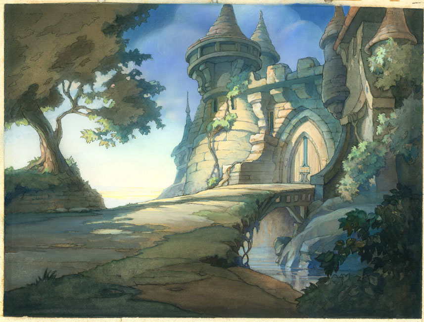
Another example: A building or room. Using the language of specified literalism you would determine what base material of construction the parts of the building are made up of. Then you would go about creating specific material and shape representations to express these objects or elements. Again a myriad of macro design choices aside, the visual language of specified literalism denotes that each brick will be defined, every stone represented, every material rather faithfully recreated in order to express a building. Again, some CG buildings culled from various films:

Here we see decorative elements meant to add an alien-esque flavor to the otherwise very literal and specific building materials we all are familiar with. Looks just like Mars should look. Ahem.

ilion bldgs.jpg

Very specific and literal, yet artfully done.
rat bldgs 2.jpg

Again we see decorative elements mean to make this monster-esque but the materials remain specific and fairly literal.
monsters bldgs.jpg

Wonky angles, slightly off proportions and lots of literal glass, brick, grass, concrete, fur, etc.
mad_bldgs.jpg

Here the specificity of materials is downplayed (the concrete doesn’t scream LOOK AT! ME I’M CONCRETE!), but the forms are quite literal.
incred_bldgs.jpg

Fairly specific and literal take on your average American suburb
ab_houses.jpg

More alien-esque decorations and design choices laid over top of specific and literal expression of forms and materials.
ilion_bldgs.jpg

The metal shelled quansit hut, floor materials, etc. all very specific and literal
cars_bldgs.jpg

Nice art deco style in the form, very specific expression of that design.
cars_bldgs2.jpg
Another subject: Flesh. Regardless of species (whether real or imagined) to denote flesh in a specified literalistic manner you would be sure to include pores, wrinkles, body hair, blemishes, freckles, marks, scars, sub surface light scattering properties (a more recent technology) or other anomolies all with some significant degree of exactness. Again, examples…

Yes, green ogres don’t exist thus this is not ‘realism’. Still the flesh is represented in a very literal fashion.

shrek skin.jpg

The entire production design of The Incredibles values understatement in materials (like the building noted above). Even so understatement means it’s still literal, it’s just being whispered instead of screamed. Get out your DVD and watch those close up shots to see what I’m talking about.
incred_skin.jpg

Less whispering. The humans in the Shrek franchise have skin that is very literal.

prince skin.jpg

Lots of close up’s of Al’s skin perhaps dictated a more literal approach.

al-big.jpg

ab_skin.jpg

With Skinner we see more subdued literal elements of pores, blemish and surface, but the subsurface scattering is turned up. Note the lip texture as well- quite specific and literal. Still a fun design from the realm of proportion. He was my favorite character to watch in the film.
rat skin2.jpg

All the humans in the film have a very healthy application of rouge to the cheeks- except the Anton Ego character. Here we see the freckles thing.
rat skin.jpg
With all of these you can almost pick any substance and find the same visual law at work. Cloth, hair, atmosphere, etc. Certainly there are many variations of design, color, form and proportion at work- all evidence of artistic decision making. Again, I’m not saying that any of this is bad or lacking imagination or anything- I’m just examining the visual evidence to try and work out some definitions. There is lots of room for artistic license within this look. But even when presented with fantastical realms, materials, colors and things CG reverts to a specificity of form that labors to lend a specific sense of realistic-ness (not realism) to the work. Regardless of scenario, theme or topic the technique of greatest recourse is a specificity with regard to elemental accuracy. No significant attempt at material or elemental abstraction is made. It’s this lack of abstractness in the majority of CG animated film efforts that has defined the de-facto “look” of CG.